Backcountry
Backcountry is one of the leading e-commerce platforms for outdoor gear and apparel, serving serious enthusiasts across hiking, skiing, climbing, and biking. They combine a large product catalog with expert-driven services, gear advice, curated recommendations, and "Gearheads" to help customers make confident purchasing decisions on technical equipment.
The mobile shopping experience, however, didn't fully reflect that expertise.
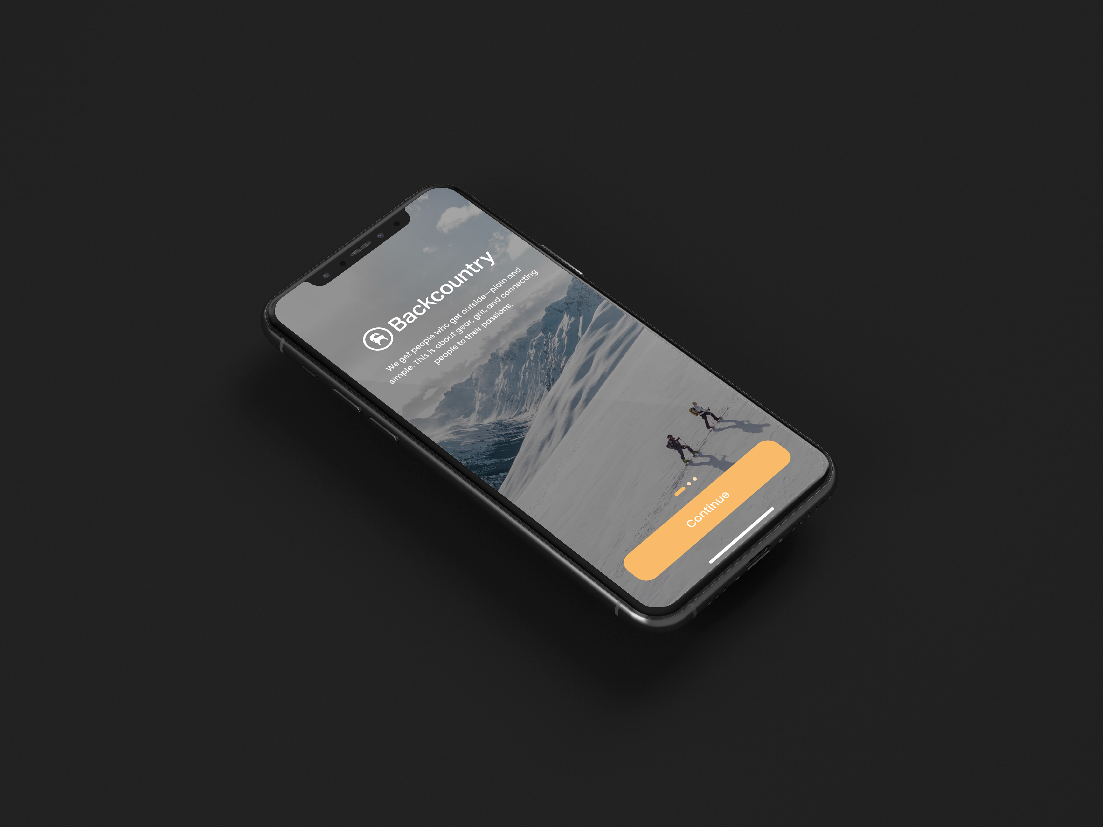
This is a speculative redesign exploring how Backcountry could better translate its brand authority into a mobile UX that earns high-confidence purchases, particularly for technical gear where the stakes of a wrong decision are high.

Key Takeaways
The Challenge
Backcountry's mobile experience created friction at the exact moments users needed confidence most (product discovery, spec evaluation, and checkout), undermining the brand's core promise of expert guidance.
My Hypothesis
The drop-off wasn't a catalog problem. It was a trust and clarity problem. Users couldn't efficiently find what they needed, evaluate whether it was right for them, or commit to a purchase without doubt.
My Approach
Focused the redesign on three moments: discovery and filtering, product storytelling, and checkout – treating each as an opportunity to either build or erode purchasing confidence.
Solution & Outcome
A more intuitive, trustworthy mobile experience that surfaces Backcountry's expert credibility at the right moments and reduces friction where it matters most, right before a purchase decision.
Lessons Learned
In high-consideration e-commerce, good UX isn't about removing steps — it's about making each step feel worth taking. Confidence is the conversion mechanism, not speed.
The Challenge
Backcountry's brand promise is expert guidance. Their Gearheads, field testing credentials, and curated recommendations are genuine differentiators. But the mobile experience wasn't delivering on that promise at the moment it mattered most (example; when a user was evaluating a $400 jacket or a technical climbing harness).
Four friction points stood out:
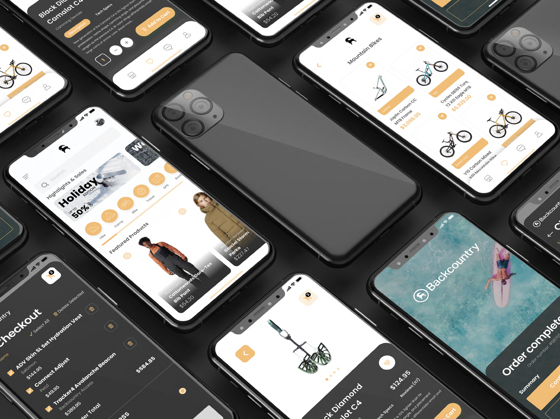
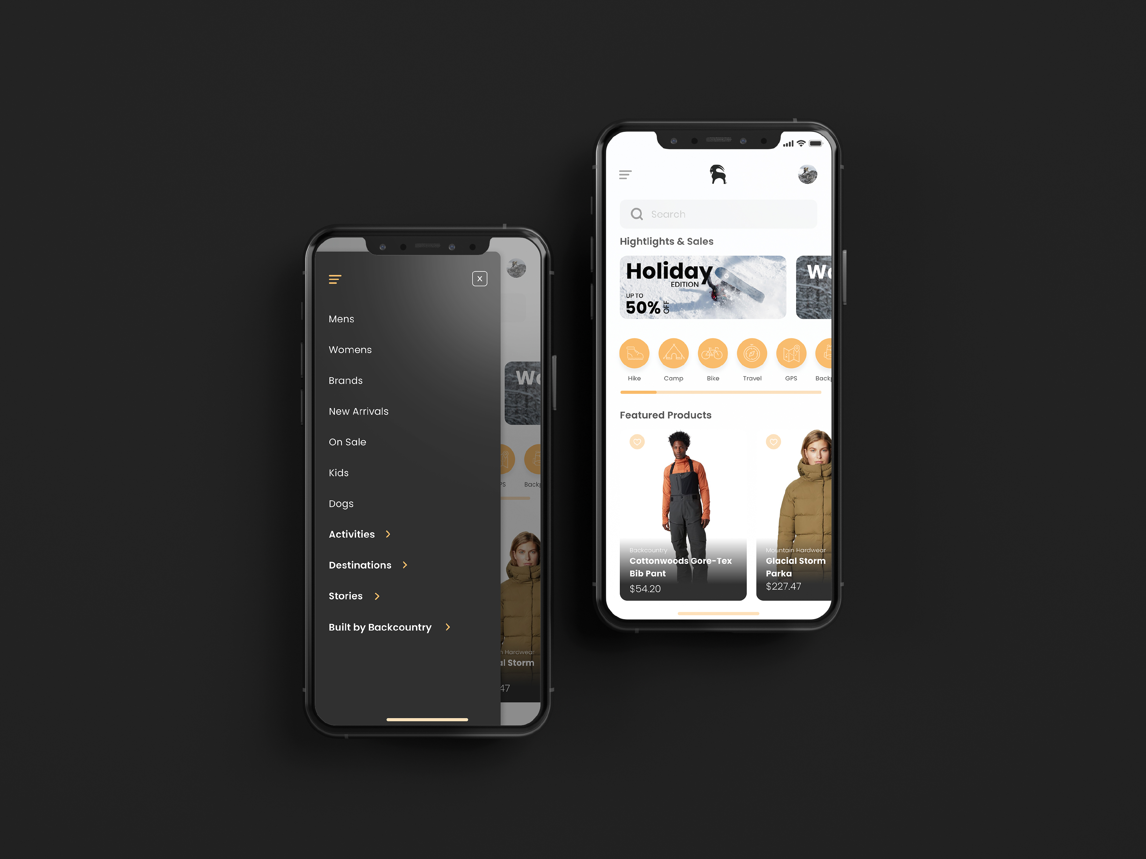
- Cluttered discovery – navigation and filtering felt overwhelming rather than helpful, making it hard for users to narrow to the right product with confidence.
- Weak product storytelling – technical specs were present but not scannable or comparable; field testing and expert endorsements weren't surfaced where they could influence decisions.
- Buried expert credibility – the Gearhead expertise that differentiates Backcountry from generic retailers was underrepresented in the core shopping flow.
- Checkout friction – unnecessary visual complexity and unclear progress at high-intent moments introduced last-minute doubt rather than sealing confidence.
The result was an experience that felt like a generic e-commerce app wearing a Backcountry logo — not a trusted outfitter helping you make the right call.
My Approach
Identifying the confidence gap
I started by framing the core design problem: in high-consideration purchases, conversion is a function of confidence, not convenience. A user buying a $350 ski helmet isn't looking for the fastest checkout, they're looking for enough signal to trust their decision. I used this framing to evaluate every existing friction point through the lens of whether it built or eroded that confidence.
Mapping the shopping journey
I mapped the end-to-end mobile shopping flow (from search and browse through product evaluation to checkout), identifying the moments with the highest drop-off risk and the greatest opportunity to inject brand credibility. Product pages and the transition into checkout were the clearest opportunities.
Leading with storytelling, not specs
One of my central design hypotheses was that Backcountry's differentiators; field testing, expert recommendations, real-world use cases, were being treated as supplementary content when they should be primary. I explored how to restructure product pages to lead with trust signals rather than bury them below the fold.
Simplifying without dumbing down
The challenge with technical gear is that the audience is knowledgeable and wants detail, but detail presented poorly becomes noise. I focused on hierarchy and scannability: how to present the right level of technical information in a way that helps an expert user evaluate quickly without overwhelming a less experienced one.
The Solution
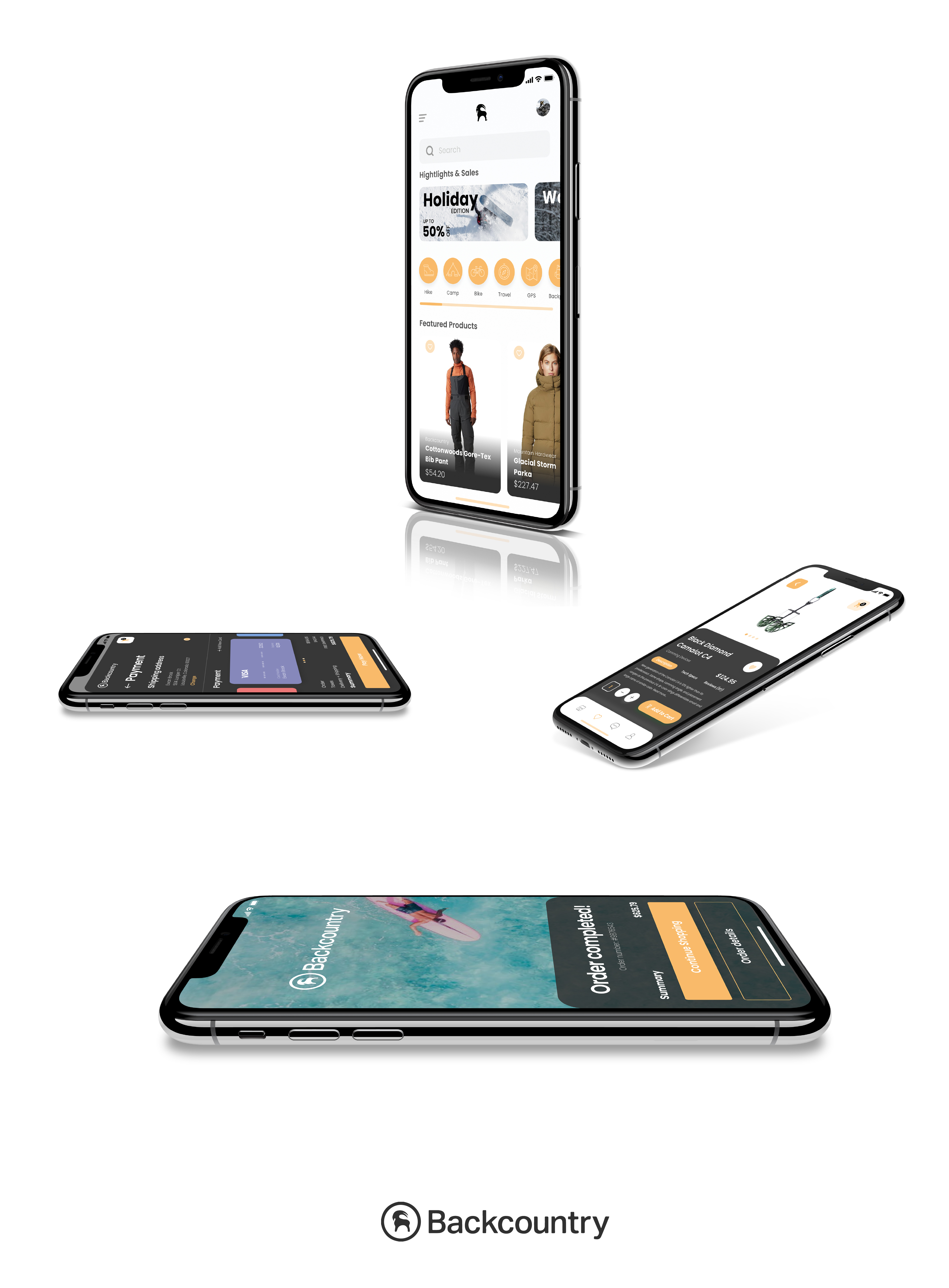
Streamlined discovery and filtering
Simplified navigation structure and a more intuitive filtering system aligned with how outdoor enthusiasts actually think about gear (by activity, condition, and fit), rather than generic retail categories. Search results were restructured to surface the most decision-relevant information at a glance.
Elevated product storytelling
Restructured product pages to lead with the signals that build confidence: field testing badges, Gearhead recommendations, and real-world use context, before diving into full spec lists. Expert credibility was treated as a design element, not a footnote.
Clarified spec hierarchy
Technical specifications were reorganized for scannability and comparison, with clear visual hierarchy that lets an experienced user find what they need quickly without overwhelming a first-time buyer.
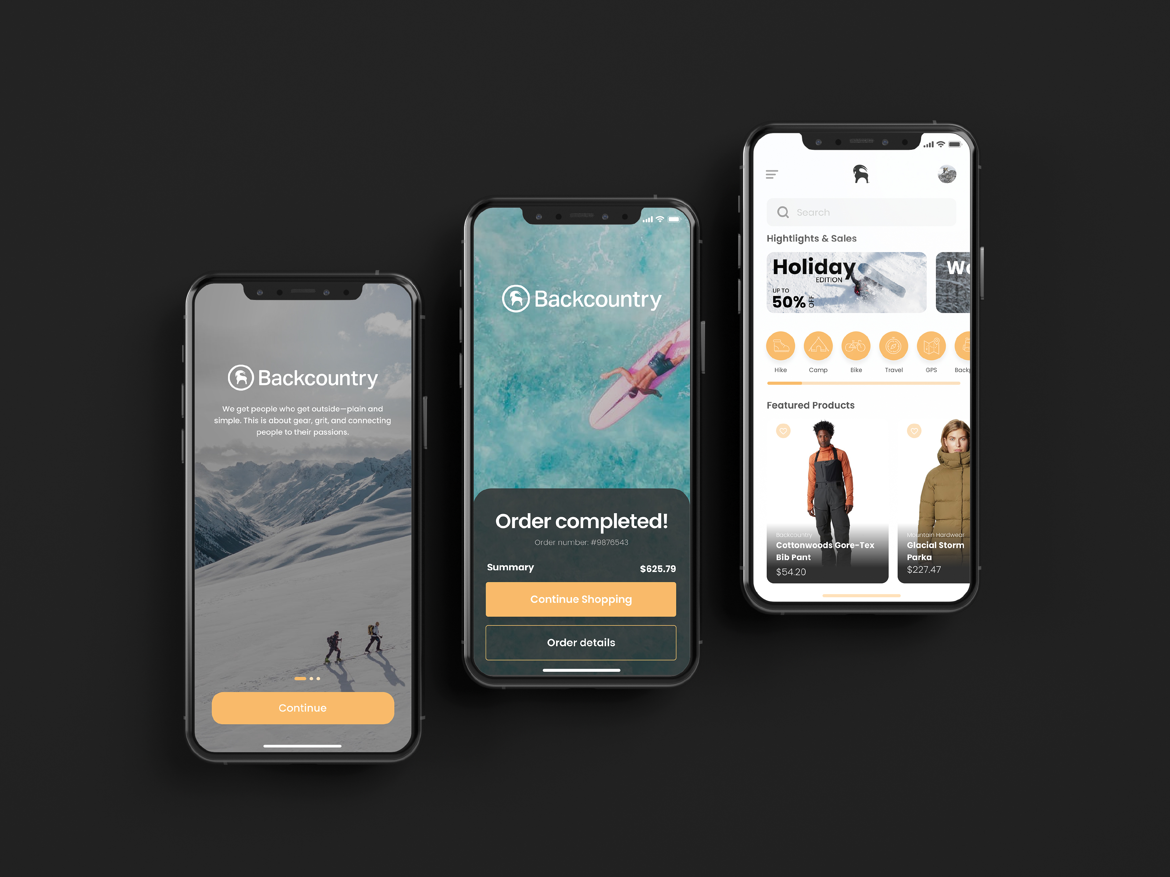
Frictionless checkout
Simplified the checkout flow with clear progress indicators, reduced visual noise, and fewer decision points at high-intent moments. The goal was to carry the confidence built on the product page all the way through to purchase completion without introducing new doubt.
The Outcome
This is a speculative project, so there are no shipped metrics. What I can speak to is the design rationale:
Every decision in this redesign was anchored to a specific trust or clarity problem, not aesthetic preference. The restructured product pages exist because Backcountry's real differentiator is expertise, and an experience that buries that expertise is leaving its strongest conversion tool unused. The simplified checkout exists because friction at the final step doesn't just lose a sale, it undermines the confidence built across the entire shopping journey.
The visual direction demonstrates that a technically rich e-commerce experience can feel calm, credible, and brand-consistent, without sacrificing the depth that serious outdoor enthusiasts expect.
Lessons Learned
High-consideration e-commerce is fundamentally different from impulse-purchase retail, and designing for it requires a different mental model. Speed and ease matter — but they're not the primary conversion drivers. Trust is. And trust in a mobile experience is built through clarity, credibility signals, and consistency — not fewer taps.
Working through Backcountry's specific challenges sharpened how I think about the relationship between brand authority and UX execution. A brand can have genuine expertise and still fail to communicate it at the moment it's most needed. That gap is a design problem — and one worth solving.