Craigslist
This is a speculative redesign exploring how Craigslist could be modernized to match the trust and clarity today's users expect – and how a principled design system could do it without erasing what makes Craigslist Craigslist.

Overview
Craigslist is still the largest classifieds site in the US, but it looks and feels abandoned. Its honest, anti-corporate, hyperlocal DNA is genuinely differentiated, and almost entirely absent from the modern secondhand marketplace category. Yet the experience hasn't meaningfully changed since 1996.
This self-initiated challenge asks a specific question: how do you modernize Craigslist without homogenizing it? The easy version of this project makes Craigslist look like Facebook Marketplace. The interesting version keeps everything that makes Craigslist Craigslist – plainspoken, local, free, anti-adtech – while giving it the photos, trust signals, and search intelligence that today's users expect. I chose this problem because that tension, modernize without erasing, is one of the hardest and most common challenges in product design.
Key Takeaways
The Challenge
Craigslist's brand equity isn't its visual design, it's what that design signals: no-frills, anti-corporate, real people, nothing to hide. Any redesign that loses that signal loses the brand, no matter how polished it looks.
My Role
Full end-to-end product design – competitive research, user framing, a business case tied to Craigslist's actual revenue model, a principled design system, and eight complete user flows across light and dark mode.
The Approach
Anchor every decision to Craigslist's differentiated DNA. I built three design principles – Plainspoken, Transparent, Local – that trace backward to a user insight and forward to a specific UI decision, so the redesign modernizes the structure without borrowing anyone else's playbook.
The Result
A photo-first, trust-forward, hyperlocal marketplace that feels unmistakably like Craigslist – modern structure and visual confidence layered onto its plain-spoken honesty, not in place of it.
Lessons Learned
The strongest brand equity is often invisible in the UI but present in what the UI communicates. Redesigning a beloved product means protecting that signal first and styling second.
The Challenge
Craigslist's issues aren't cosmetic, they're structural, and each one carries a real cost. I framed four core problems:
Trust & safety. Scams are the number-one user complaint – fake cashier's checks, too-good-to-be-true rentals, zero verification. Trust is simultaneously Craigslist's biggest liability and its biggest untapped opportunity.
Text-first, photo-last. The core experience is still text lists with photos as an afterthought – completely out of step with how people browse marketplaces today.
Weak search and filtering. Search has been a user complaint for over a decade: limited filters, no saved searches that persist meaningfully, no smart sorting.
No visual hierarchy. Everything carries the same visual weight. A $5 free couch and a $2,000 apartment look identical. Nothing signals what matters.
These aren't independent, they compound. Text-first browsing makes weak search more painful; no hierarchy makes scam listings indistinguishable from legitimate ones. Solving one in isolation wouldn't move the experience.
My Role
This was a self-directed challenge where I owned every layer of the work: competitive and category research, user definition, problem framing, the business rationale, the design system and principles, and the full interaction design across eight flows in both light and dark mode. It's the piece in my portfolio that most completely shows how I think from strategy through shipped-quality UI.
My Approach
Defining the two users
I anchored the work to two distinct intents. The Hunter browses open-ended – scanning for deals, furniture, free stuff, gigs – and wants fast visual scanning and the thrill of discovery. The Searcher knows exactly what they want – a specific bike model, a two-bedroom under $1,500 in a specific neighborhood – and wants precise search with minimal noise. Every core surface had to serve both without compromising either.
Studying the category....and the gap
I audited the competitive landscape and found that every player solves one facet of the secondhand marketplace and misses the others. Facebook Marketplace has photos and reach but feels like a data-mining ad platform with no seller identity clarity. OfferUp has ratings and chat but suffers from five-star inflation and a used-car-lot pressure to counteroffer. Nextdoor has real, verified neighbors but buries "For Sale" under gossip. Craigslist itself remains honest, local, free, and anti-adtech – but wrapped in a 1996 UI with no photos above the fold and no trust signals.
The gap was clear: no one owns photo-first AND trustworthy AND anti-corporate. Craigslist is the only brand positioned to be all three – if the experience caught up to the DNA.
Making the business case
I grounded the redesign in Craigslist's actual revenue model – paid job and apartment listings – and mapped each UX problem to a business cost. Trust failures push sellers to Facebook Marketplace. No hierarchy drives faster abandonment and fewer listing views per session. Weak search means users skip the high-value categories (jobs, housing) where Craigslist actually makes money. No personalization means one-and-done sessions with no reason to return. This gave the redesign a set of metrics to move: sessions per week, listings viewed per session, message-to-listing conversion, and Day-7 / Day-30 retention. Design decisions in service of business outcomes, not just aesthetics.
Writing principles before pixels
Rather than jump to screens, I wrote three design principles tight enough to memorize and specific enough to argue with, each tracing back to an insight and forward to a UI decision:
- Plainspoken – speak like a person, not a product page. Search accepts full sentences. Listing titles keep the seller's voice ("Couch – free, must pick up"). Buttons say what they do ("Message Sarah"), not what a brand strategist wants.
- Transparent – show what's really there, hide nothing. A trust module (verified state, member years, reply rate) appears on every listing. Timestamps are exact, in mono type, like a receipt. The search AI explains what it interpreted from your query.
- Local – your neighborhood is the default filter. Location is always visible under the search bar. Neighborhoods are underlined blue links, not tags. Public meetup spots are suggested per neighborhood.
These principles did the heavy lifting: they let me modernize aggressively while guaranteeing every decision still pointed back to Craigslist's core identity.
The Solution
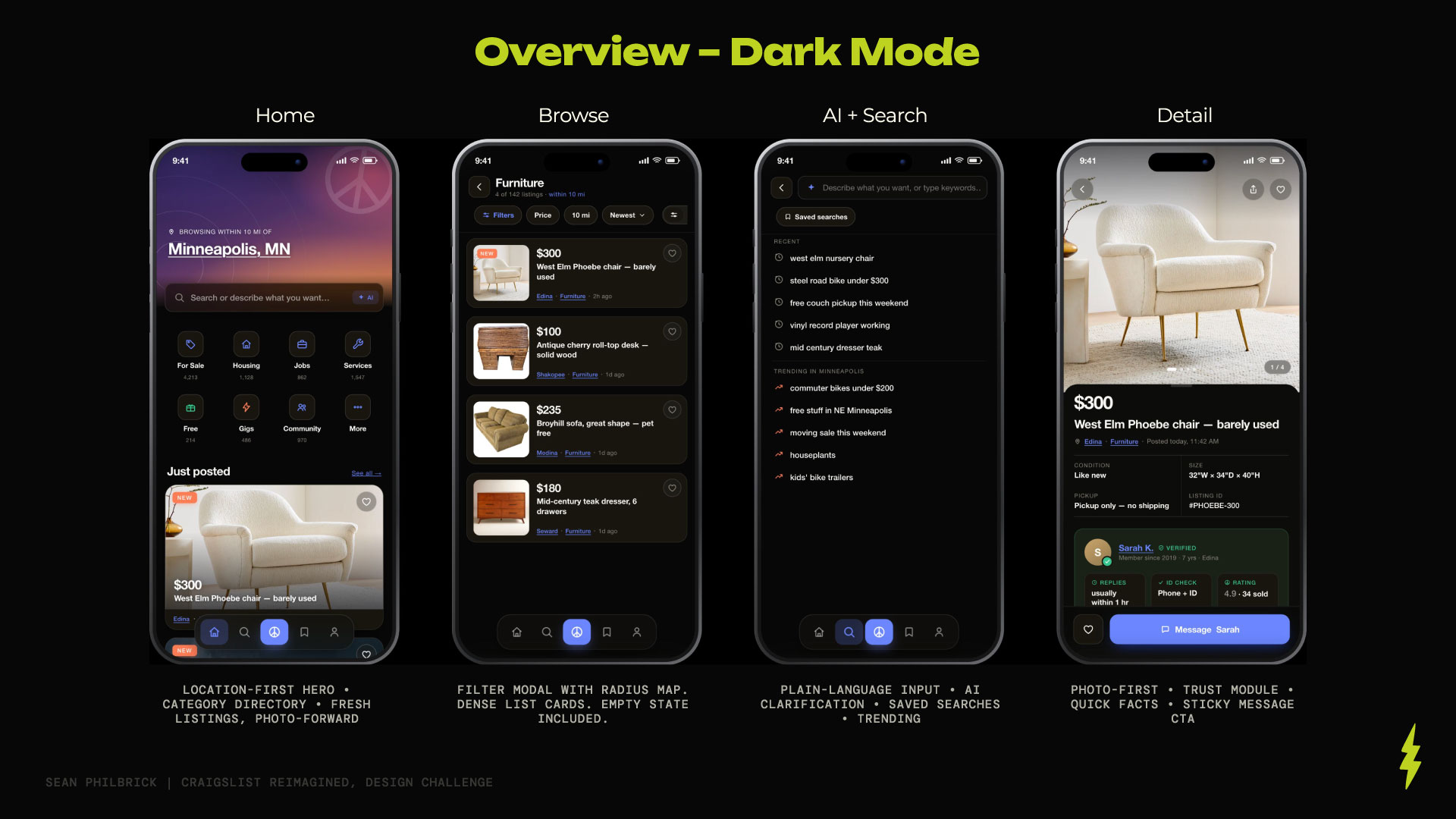
The redesign layers modern structure onto Craigslist's plain-spoken honesty across eight flows. The design system is the container, text-first density, real underlined links, mono metadata, and the Craigslist peace mark threaded at every scale, with Helvetica Neue for editorial hierarchy and JetBrains Mono for metadata: the newspaper and the receipt. Craigslist Blue is treated as an identity, not an accent –used for genuine underlined links – while Trust Green exists as its own dedicated system, reserved only for verification.
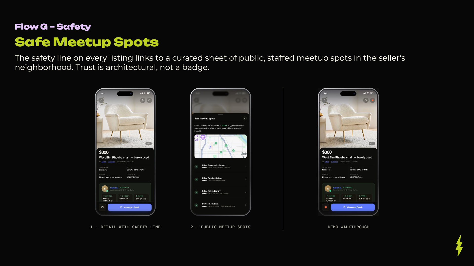
Trust, built into the UI. Rather than treating safety as a policy page, I made it architectural. A trust module lives on every listing. A dedicated seller profile (Flow F) surfaces verifications, years on the platform, response rate, and a peace-rating drawn from real sales, in one honest scroll. And the safety line on every listing opens a curated sheet of public, staffed meetup spots in the seller's neighborhood (Flow G). Trust is architectural, not a badge, and none of it requires new backend infrastructure to design for.
Photo-first browsing. A card-based, photo-forward browse experience (Flow C) modernizes the feel instantly without changing what Craigslist fundamentally is, a list of things people are selling nearby. The same result set is offered three ways – List, Gallery, and Map with price pins – because density is a design decision, not a novelty, and the default respects Craigslist's text-forward roots. The posting flow (Flow H) puts photos first, directly correcting Craigslist's biggest historical miss, then lets sellers describe in plain language and preview exactly what buyers will see.
Smarter, lighter search. The search experience (Flow D) accepts a plain-language sentence and shows the filters it inferred as tappable chips the user can edit – the AI explains its interpretation rather than hiding it. Saved searches persist meaningfully and sit one tap from the empty search state. Filter chips and a radius map that renders distance as a real circle around the user's city (Flow B) reduce the "I have to know exactly what I'm looking for" friction that defines Craigslist today. When a filter combination turns up empty, the app says so plainly and offers a way back.
Retention through light personalization. Saved searches and favorites give users a reason to return to the app specifically, something the website has never done well. A three-slide onboarding (Flow A) asks for one permission, and the location prompt explains itself instead of guessing. And messaging (Flow E) opens every conversation with a first-message template so buyers don't stall, with a green safety strip always visible above the compose field.
Motion throughout is deliberately restrained – only navigation transitions and the search-radius ring animate. No decorative loops. The polish is in the structure, not the flourish.
The Outcome
As a self-initiated challenge, there are no shipped metrics, but the design rationale is the point. Every decision traces to a user insight and a business cost, and the whole system is accountable to a single premise: Craigslist's value is its honesty, and the redesign has to make that honesty visible rather than trade it away for polish.
The result is a marketplace that a longtime Craigslist user would still recognize – plain, local, direct – but that a first-time user would find genuinely modern: photo-first, trustworthy, and easy to search. It modernizes the structure without homogenizing the brand, which was the entire challenge.
Lessons Learned
The hardest part of this project wasn't the UI, it was the discipline. It's easy to redesign Craigslist into something sleek and generic. The interesting constraint was self-imposed: every modern element had to earn its place against the brand's DNA, not just look good on its own. Writing the three principles first – Plainspoken, Transparent, Local – was what made that possible. They turned "modernize without homogenizing" from a vague ambition into a decision filter I could apply to every screen.
It also reinforced something I believe about strategy and craft: they aren't sequential phases. The competitive research, the business case, and the design principles didn't precede the design work, they were the design work. The screens are just where all of it becomes visible.