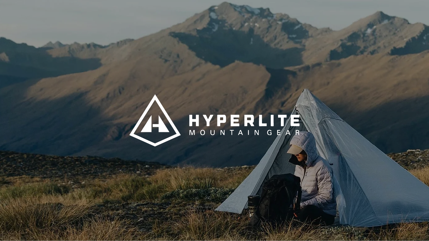
Hyperlite Mountain Gear
Hyperlite Mountain Gear makes some of the most respected ultralight backpacks, shelters, and accessories in the outdoor industry. Their products are engineered with Dyneema® composite fabrics, exceptionally strong, exceptionally light, and built for people who take the wilderness seriously. The brand philosophy is uncompromising: carry less, go further.
The website, however, didn't fully embody that philosophy. The products were premium. The digital experience wasn't keeping pace.
This is a speculative redesign exploring how Hyperlite Mountain Gear's site could be elevated to match the quality of what it's selling and how a purpose-built design system could make that elevation sustainable.
Key Takeaways
The Challenge
Hyperlite's site presented products cleanly but struggled with visual hierarchy, inconsistent UI patterns, and a lack of scalable foundations, making it harder for users to evaluate technical gear and harder for teams to maintain and grow the experience.
My Hypothesis
The gap wasn't just aesthetic. Without a coherent design system underneath, every new product launch compounded the inconsistency. Fixing the surface without fixing the foundation would only solve half the problem.
My Approach
Treated this as a design systems problem first and a visual redesign second. I established the foundational tokens, components, and patterns before applying them to key pages. The brand's minimalist philosophy wasn't just an aesthetic choice; it was the design brief.
Solution & Outcome
A cleaner, more scalable e-commerce experience built on a modular design system that reflects the brand's core idea, and gives the team a foundation to ship new pages consistently without starting from scratch each time.
Lessons Learned
A brand's product philosophy is almost always the best design brief available. Hyperlite's "carry less, go further" isn't just a tagline, it's a set of design principles: remove what isn't necessary, make what remains work harder.
The Challenge
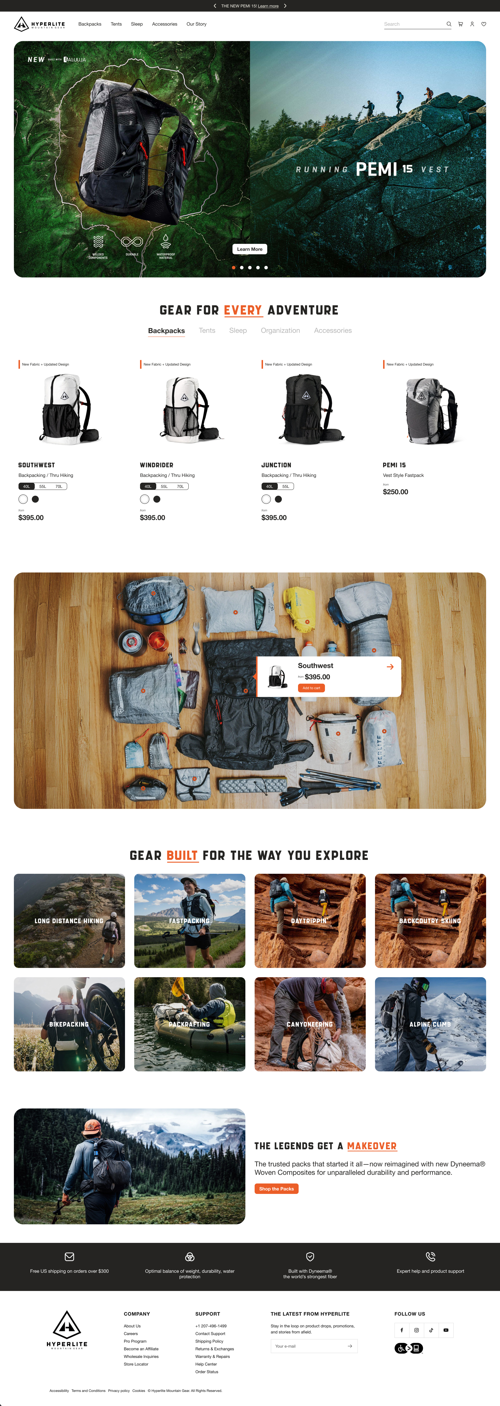
Hyperlite Mountain Gear's existing site had the right instincts, clean layouts, strong product imagery, a restrained aesthetic. But underneath the surface, several structural issues created friction for both users and the team maintaining the site.
Visual hierarchy challenges
Product grids and spacing made scanning difficult. Technical specifications and product storytelling competed for attention on the same page rather than working together, leaving users with more information than clarity.
Inconsistent UI patterns
Similar components appeared across product pages built slightly differently each time. Buttons, product cards, and content modules weren't standardized, creating subtle visual noise that undermined the premium feel the brand was aiming for.
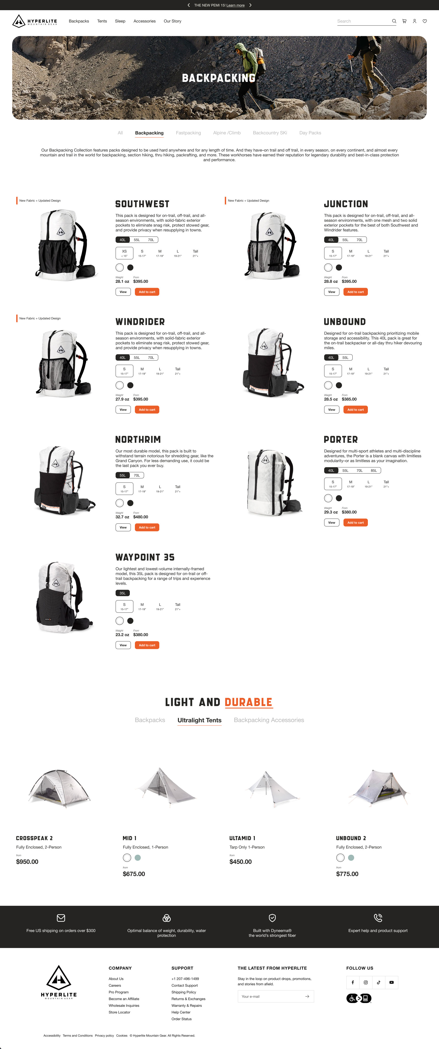
Complex gear selection without guidance
Hyperlite's product line is technically dense. Customers choosing between packs or shelters need help understanding which product fits their use case, not just a list of specs. The existing experience leaned heavily on technical detail without providing the contextual guidance that turns detail into a confident decision.
No scalable design foundation
New product launches required custom page layouts built from scratch. Without a centralized design system, maintaining consistency across marketing and commerce pages became increasingly difficult as the catalog grew.
These issues reinforced each other. A fragmented UI made the technical content harder to parse. The lack of a design system made every inconsistency harder to fix at scale.
My Approach
The brand as the design brief
My starting point wasn't the UI, it was the brand philosophy. "Carry less, go further" is a precise design brief: reduce everything to what's essential, and make what remains perform at the highest level. I used this as a filter for every design decision throughout the project. If an element didn't earn its place, it didn't belong.
Design system before screens
Given that scalability was one of the core problems, I approached this as a systems project first. Before designing pages, I established the foundational layer: typography scale, color tokens, spacing system, and a component library built around the brand's visual language. This meant that when I moved to page design, every element was already part of a coherent system rather than a one-off decision.
Prioritizing the right pages
Rather than attempting a full site redesign, I focused on the three pages with the highest impact on user experience and conversion: the homepage, collection pages, and product detail pages. These are the moments where users decide whether to trust the brand, narrow their options, and commit to a purchase. Getting these right (and building them on a shared system), would have the most leverage.
Solving for the technical-clarity tension
Ultralight gear buyers are knowledgeable and want specification detail. But raw spec lists don't help users choose, they just add cognitive load. I explored how to present technical information at the right level of detail for the right moment: scannable at the collection level, deeper and contextualized at the product level, always tied to real-world use rather than isolated numbers.
The Solution
A purpose-built design system
Built a modular design system grounded in the brand's minimalist philosophy, clear typographic hierarchy for product scanning, a neutral palette that lets gear imagery lead, consistent spacing and layout logic, and standardized components including product cards, specification modules, and feature highlights. The system is designed to let teams build new pages faster without sacrificing consistency.
Simplified product discovery
Restructured navigation around how outdoor enthusiasts actually think about gear (by activity, condition, and intended use), rather than internal product categories. Improved filtering and clearer pack comparison tools give users the scaffolding to make confident decisions without needing to cross-reference multiple pages.
Elevated product storytelling
Redesigned product pages to lead with what earns trust: real-world context, performance credentials, and feature callouts tied to specific use cases. Technical specifications are still present and detailed, but they follow the story rather than leading with it. Larger, more purposeful product imagery reinforces the brand's outdoor credibility throughout.
Consistent, scalable page architecture
Homepage, collection pages, and PDPs were all built from the same system components, creating visual consistency across the experience and a reusable blueprint for future product launches.
The Outcome
This is a speculative project, so there are no shipped metrics. What I can speak to is the design rationale:
The redesign is grounded in a single premise: a brand that makes uncompromising products deserves a digital experience that reflects the same standard. Every decision, from the typographic scale to the specification module layout, was made in service of that alignment.
The design system is the more durable deliverable. Visual redesigns age. A well-structured component library and token system gives a team the tools to maintain quality as the product line evolves, without rebuilding from scratch each time.
Lessons Learned
The most interesting constraint in this project was self-imposed: treating the brand philosophy as a design system principle, not just a brand guideline. "Carry less, go further" pushed me to question every element – is this earning its place, or is it just there? That discipline produced cleaner decisions than I would have made otherwise.
This project also reinforced something I've come to believe strongly from my work at Specialized: visual design and systems design aren't separate disciplines to sequence one after the other. The best visual outcomes emerge from systems thinking applied from the start – and the most scalable systems are built with real visual problems in mind.
.jpg)