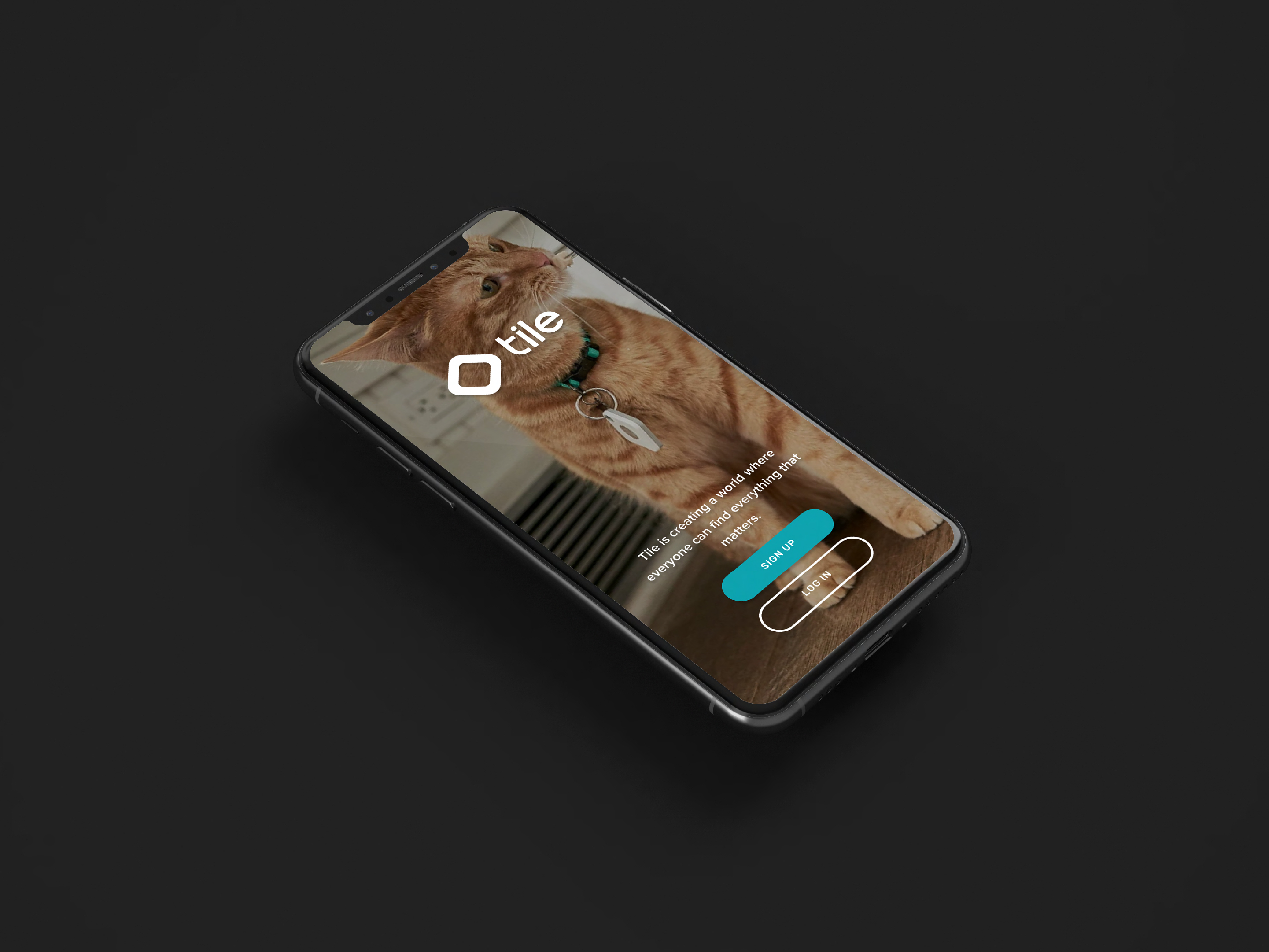
Tile
Tile makes Bluetooth tracking devices that help people find everyday essentials – keys, wallets, pets, bags, etc. The product has strong brand recognition and millions of active devices in the market. But the app experience wasn't keeping up with the hardware.
I chose Tile because the gap between the product's utility and its app experience presented a clear, interesting design challenge: how do you keep users engaged with an app they only open when something is already lost?
This is a speculative redesign exploring how Tile could better translate its physical product value into a digital experience that drives engagement, retention, and Premium adoption.
Key Takeaways
The Challenge
Despite strong brand recognition, nearly half of Tile users rarely engaged with the app after initial setup, suggesting the experience wasn't communicating ongoing value beyond the "lost item" moment.
My Hypothesis
Drop-off wasn't a hardware problem. It was a UX problem, friction at critical moments, underutilized features buried in navigation, and a Premium upgrade path that didn't earn its ask.
My Approach
Focused the redesign on three levers: reducing friction in high-stress recovery flows, surfacing feature value in everyday interactions, and building a clearer, more emotionally resonant path to Premium.
Solution and Outcome
A more intuitive, value-driven experience across app and web, designed to deepen habitual engagement and grow the Premium community beyond power users.
Lessons Learned
Engagement problems in utility apps are rarely about features. They're almost always about whether the product communicates its value at the right moment, in the right way.
The Challenge
Tile had a retention problem hiding in plain sight. Active devices were in millions of pockets and bags, but the app wasn't earning regular opens.
My analysis identified four compounding issues:
- Low post-onboarding engagement – once set up, most users only returned to the app in a moment of panic, making the experience feel reactive rather than valuable.
- Underutilized features – capabilities beyond basic item location existed but weren't discoverable within normal usage patterns.
- Unclear Premium value – the upgrade path existed, but the in-app experience didn't build a convincing case for why Premium was worth it.
- UX friction at the worst moments – when a user is already stressed about a lost item, any extra tap or unclear feedback erodes trust in the product.
My hypothesis – a direct link existed between these experience gaps and the engagement drop-off. Fixing the UX wouldn't just improve usability, it would change how users perceived the product's ongoing value.
My Approach
Defining the engagement gap
I started by identifying the moments where Tile had the most to gain: onboarding completion, the item-finding flow, and the Premium upgrade consideration. These are the three points where the experience either earns or loses the user's trust. I used these as anchors for the redesign rather than approaching the whole app at once.
Mapping the emotional journey
Tile users aren't just completing tasks – they're managing anxiety. A lost item is a stressful moment, and the app either relieves that stress quickly or compounds it. I mapped the emotional arc of a typical "lost item" interaction to identify where friction was highest and where design could provide the most relief, clarity of feedback, speed of access, and confidence in the outcome.
Surfacing value beyond emergencies
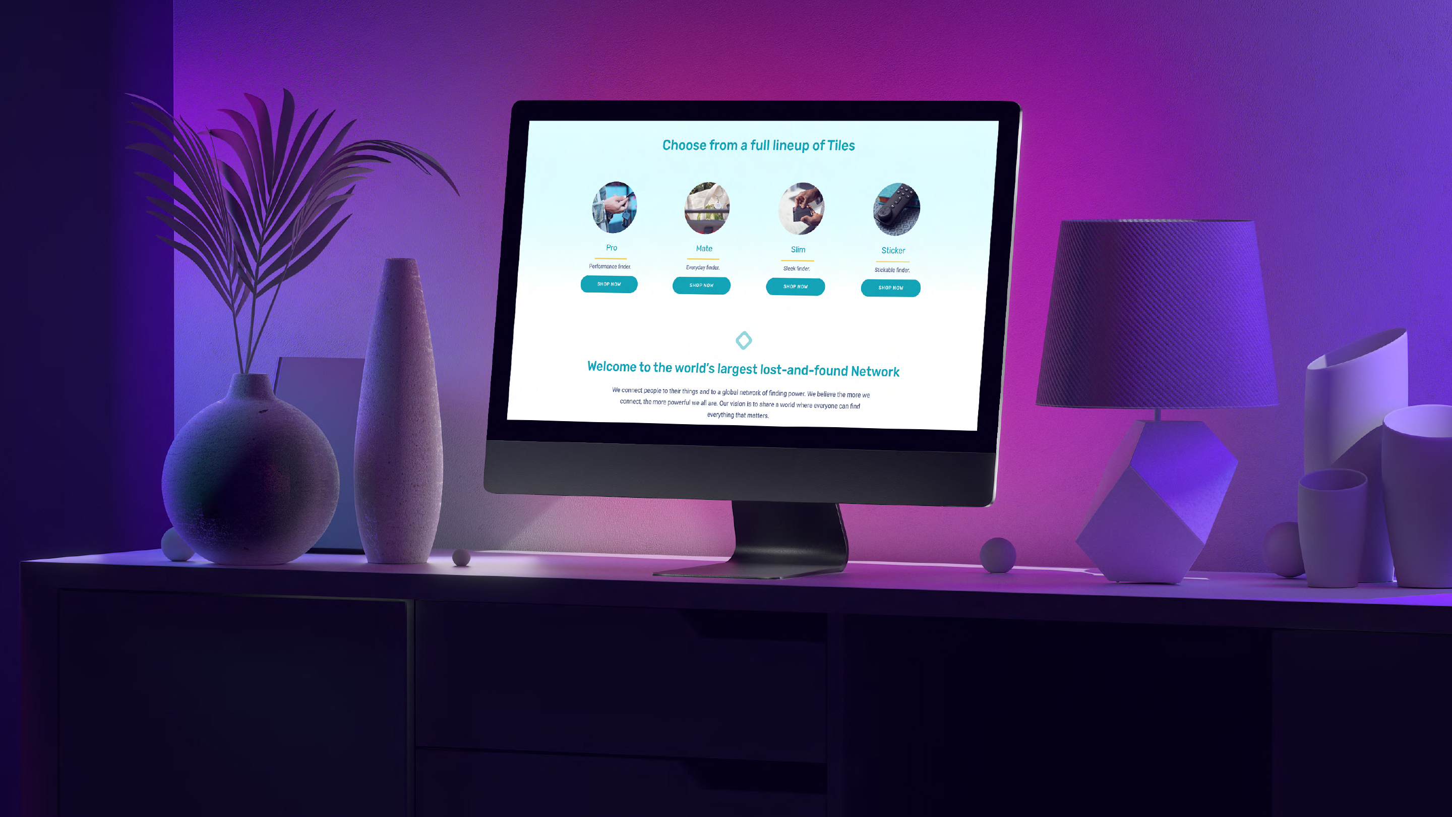
The harder design challenge was making Tile feel worth opening when nothing was lost. I explored ways to surface feature value, location history, sharing, smart alerts, within the natural flow of the app rather than burying them in settings. The goal was to shift the mental model from "emergency tool" to "everyday companion."
Aligning app and web
The inconsistency between Tile's app and web experiences created unnecessary cognitive load for users who moved between both. I treated visual and interaction consistency across platforms as a design requirement, not an afterthought.
The Solution
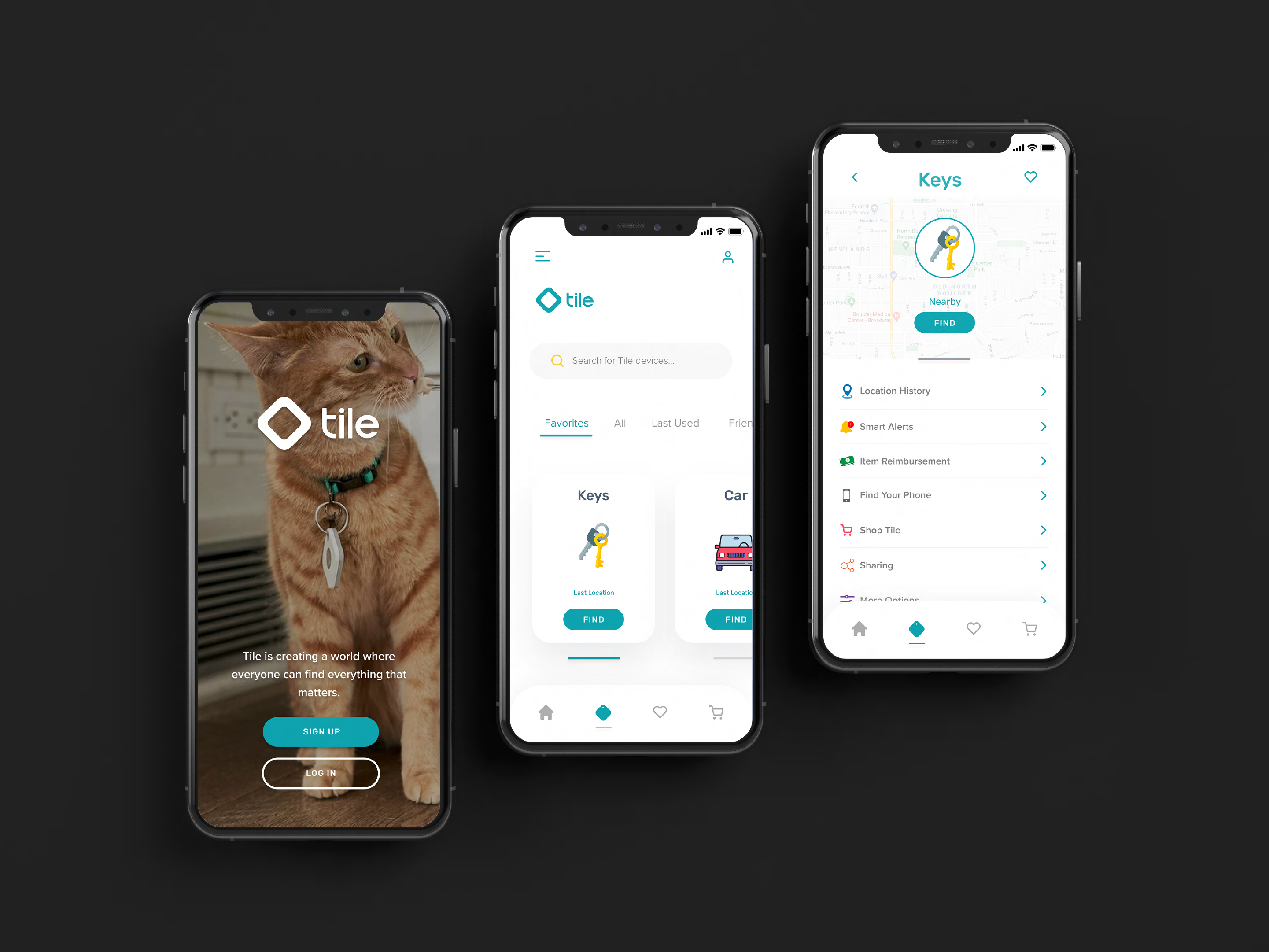
Simplified item-finding flow
Reduced the steps and visual noise in the core recovery flow. Clearer location feedback, stronger signal indicators, and faster access from the home screen mean that when a user needs the app most, it gets out of their way.
Surfaced features within core flows
Underused features like location history and smart alerts were repositioned within the natural path of everyday use rather than hidden in secondary navigation. The intent was to create discovery moments that felt useful, not promotional.
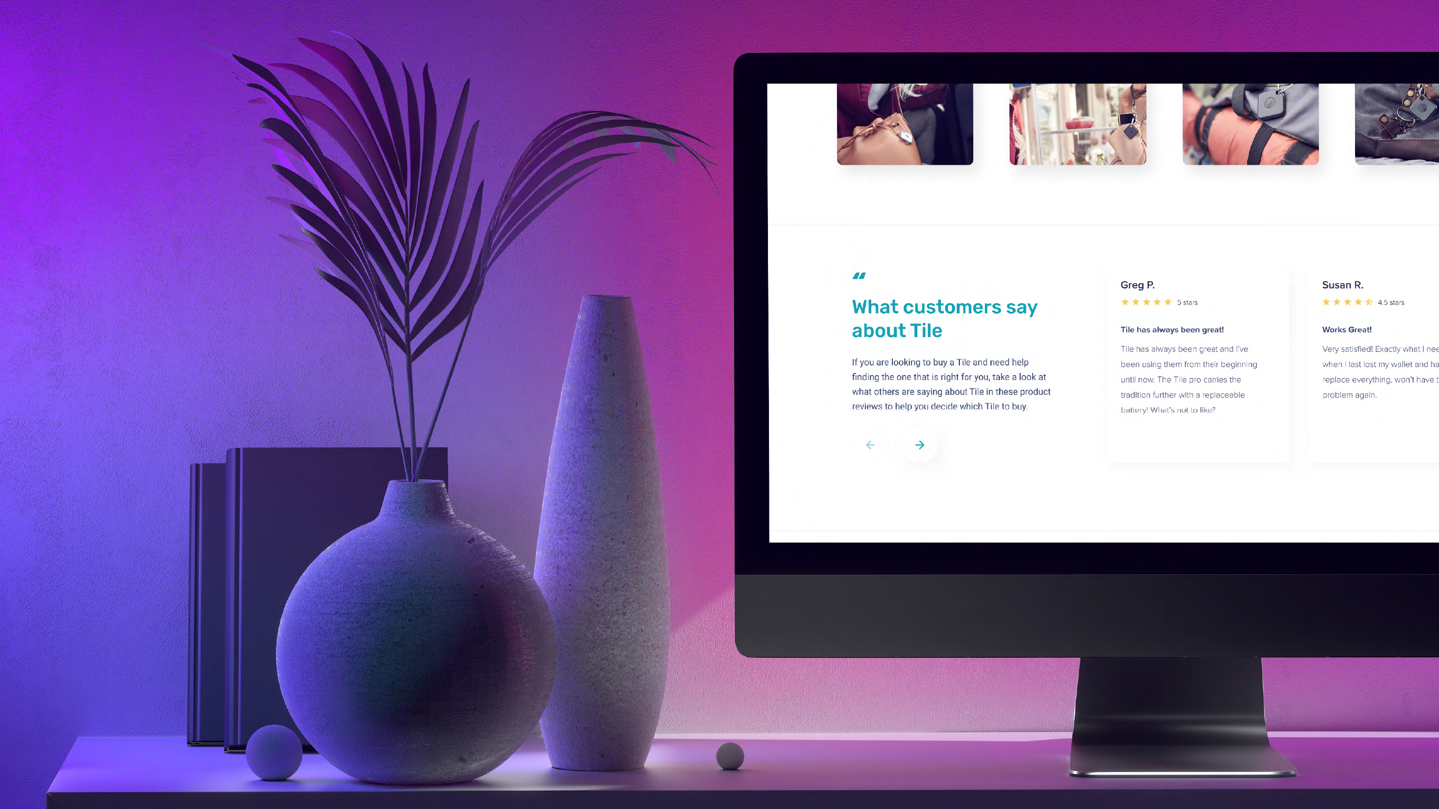
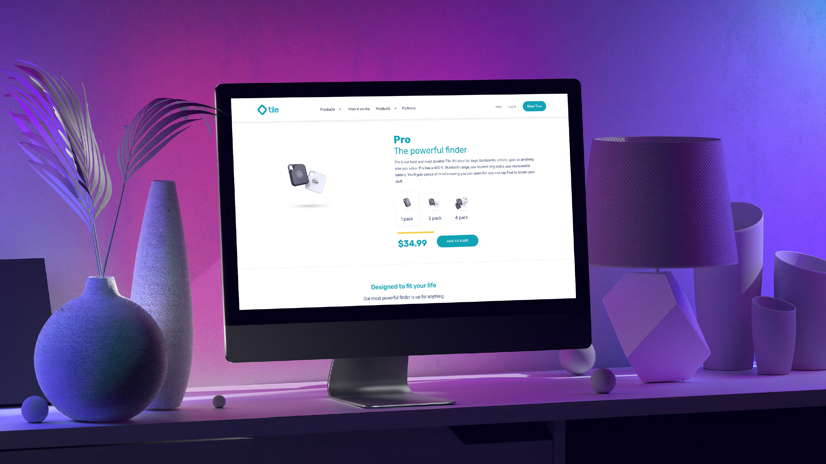
Clearer Premium upgrade path
Redesigned the Premium consideration experience to lead with specific, concrete benefits tied to moments users had already experienced rather than a generic feature list. Testimonials and recovery stories were integrated to build emotional credibility alongside functional value.
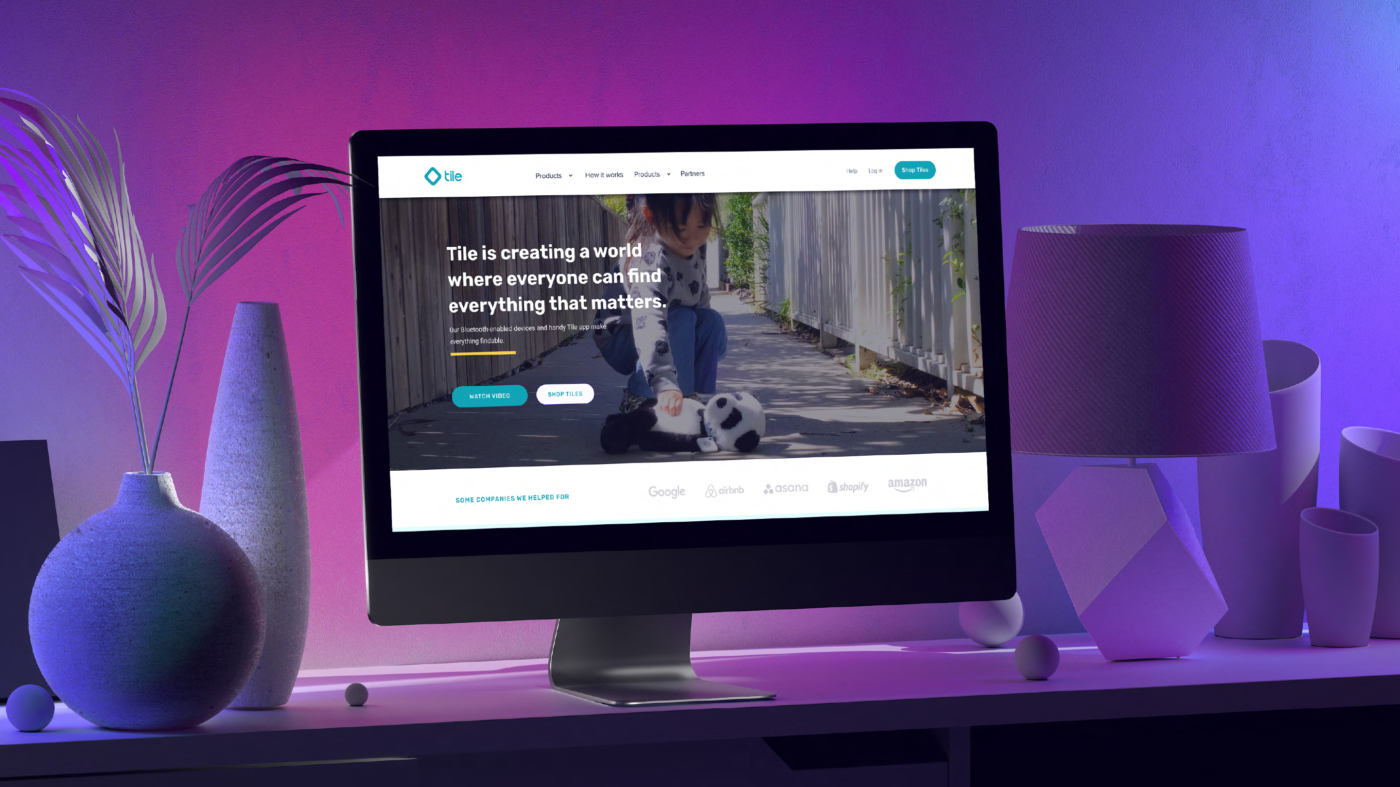
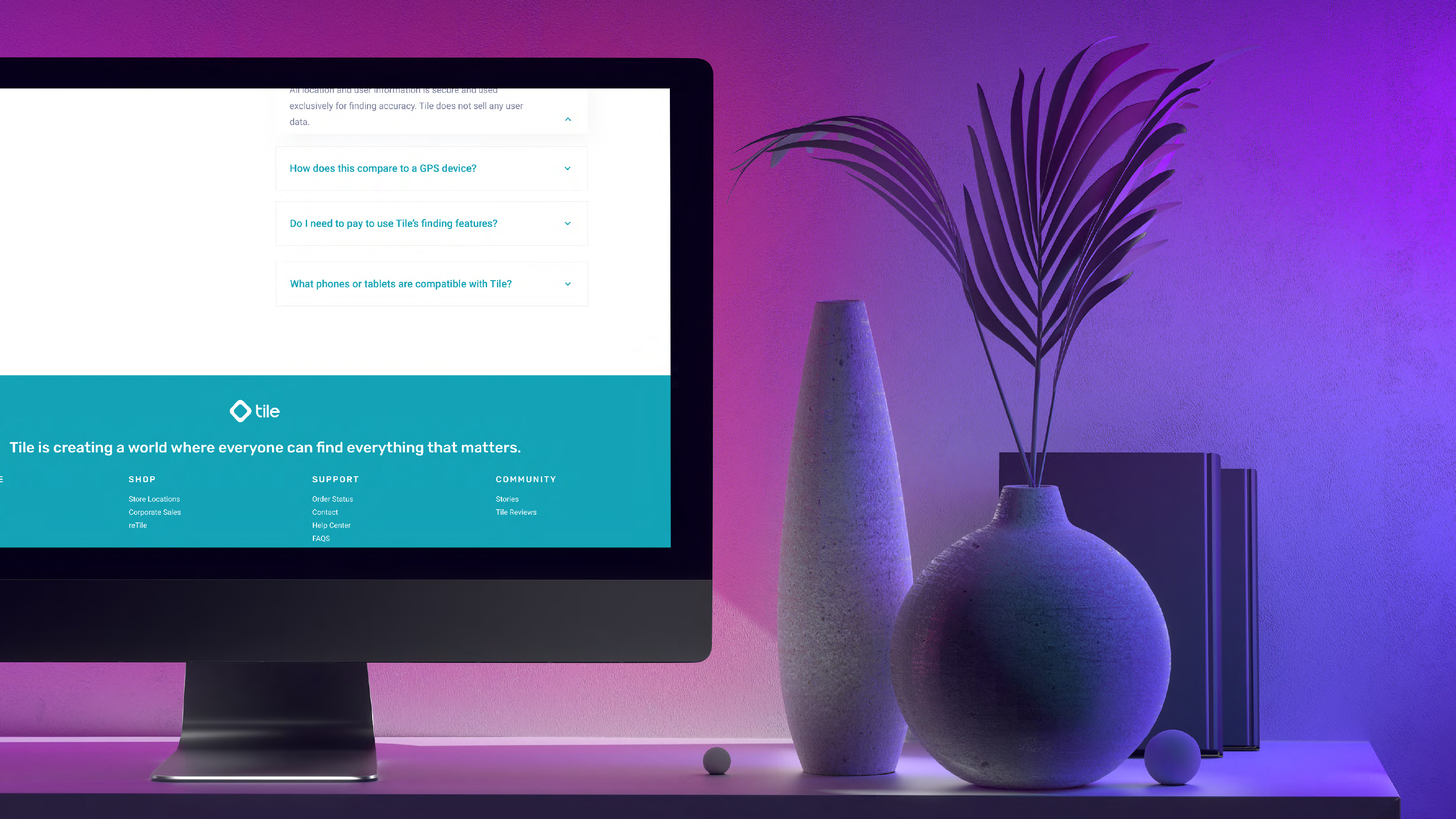
Consistent app + web experience
Standardized navigation patterns, visual language, and interaction behavior across mobile and web, reducing friction for users who move between both and reinforcing a single, coherent brand experience.
Accessible, broader-audience design
Simplified hierarchy and improved accessibility standards to widen Tile's addressable audience beyond tech-comfortable early adopters.
The Outcome
This is a speculative project, so there are no shipped metrics to report. What I can speak to is the design rationale:
Every decision in this redesign was anchored to a specific behavioral problem, not a visual preference. The restructured item-finding flow exists because friction in high-stress moments destroys trust. The surfaced features exist because value that isn't seen isn't value. The Premium path exists because an upgrade ask only works when the product has already earned it.
The visual direction demonstrates that a utility-first app can feel clear, calm, and trustworthy without sacrificing the brand's warmth.
Lessons Learned
Speculative work is most useful when it's disciplined. It's easy to redesign an app and make it prettier. The harder, more interesting challenge is identifying a behavioral problem worth solving and making every design decision accountable to that problem.
Tile's core challenge – converting occasional, reactive users into habitual, engaged ones. This challenge is shared by nearly every utility app on the market. Working through it here sharpened how I think about engagement design, retention loops, and the relationship between product value and product experience.