Craigslist
Modernizing a marketplace, without losing its identity
Design Challenge: A speculative and self-initiated redesign exploring, "how can you modernize Craigslist without losing what makes it 'Craigslist'?"

Overview
Redesigning Craigslist without erasing its DNA
Craigslist is still the biggest classifieds site in the US, but it looks and feels abandoned. It hasn't really changed since 1996. The thing that makes it different (honest, local, free, anti-corporate) is exactly what the modern secondhand market doesn't have.
So I gave myself one question: how do you modernize Craigslist without making it generic? The easy version turns it into Facebook Marketplace. The good version keeps what makes it Craigslist and adds the photos, trust signals, and search people expect now. I picked this challenge because that challenge, modernize without erasing. is one of the hardest, most common problems in product design. I owned the whole thing: research, user framing, a business case tied to Craigslist's real revenue, a design system with principles, and eight full flows in light and dark. It's the piece that best shows how I go from strategy to finished UI.
Challenge
The problems aren't cosmetic – they're structural and they compound
1. Trust & safety
Scams are the top complaint from users (fake cashier's checks, "too good to be true" rentals, no verification, etc.). Trust is Craigslist's biggest liability and biggest opportunity.
2. Text-first, photo-last
The core experience is still "text lists" with photos as an afterthought, completely out of step with how people browse marketplaces today (Facebook Marketplace, Airbnb, Depop, etc.).
3. Weak search
Search has been a long-running complaint for over a decade – limited filters, no saved searches that persist meaningfully, no smart sorting.
4. No hierarchy
Everything looks the same weight. A $5 free couch and a $2,000 apartment listing are visually identical. Nothing signals what matters.
Approach
Anchor every decision to Craigslist's DNA
The Hunter | The Searcher |
|---|---|
Open-ended, scanning for deals, furniture, free stuff, gig opportunities. Wants fast visual scanning, filters, and the thrill of discovery. | Knows exactly what they want (a specific bike model, a 2 bedroom apartment under $1,500 in a specific neighborhood), wants fast, precise search and filtering with minimal noise. |
I anchored everything around these two users.
Studying the category – and the gap
Everyone solves one piece and misses the rest. Facebook Marketplace has photos and reach but feels like an ad platform, and you can't tell who the seller is. OfferUp has ratings and chat but every seller's got five stars and there's that used-car-lot pressure to haggle. Nextdoor has real verified neighbors but buries "For Sale" under gossip. Craigslist stays honest, local, free, anti-adtech – stuck in a 1996 UI with no photos up top and no trust signals. Nobody owns a photo-first, trustworthy, and anti-corporate platform all at once. Craigslist is the only one that could, if the experience caught up to the DNA.
Making the business case
I tied the redesign to how Craigslist actually makes money (paid job and apartment listings) and mapped each UX problem to a cost. Trust issues push sellers to Facebook. No hierarchy means people bail faster and view fewer listings. Weak search means they skip jobs and housing, the categories that pay. No personalization means they come once and don't come back. That gave me real numbers to aim at: sessions per week, listings viewed per session, message-to-listing conversion, and Day-7 / Day-30 retention.
Principles before pixels
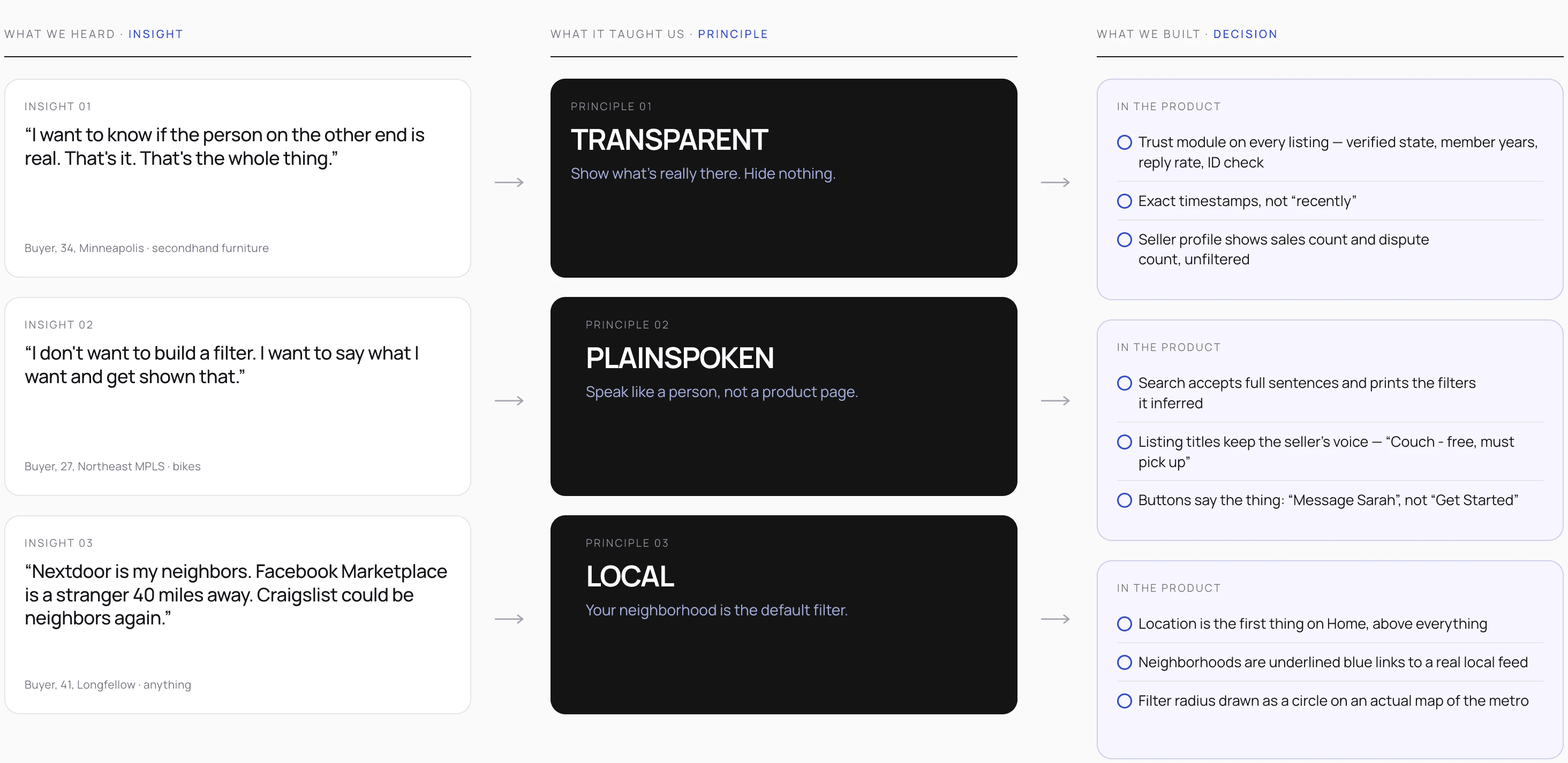
Instead of jumping to screens, I wrote three principles each tied to an insight and a UI decision:
→ Transparent
Talk like a person, not a product page. • Search accepts full sentences and translates them into filters you can see • Listing titles keep the seller's voice, "Couch - free, must pick up" • Buttons say what they do ("Message Sarah"), not what a brand strategist wants ("Get Started")
→ Plainspoken
Show what's really there. Hide nothing. • The trust module. Verified state, member years, reply rate, dispute count is on every listing • Timestamps are exact, in mono type, like a receipt • Search AI explains what it interpreted from your query
→ Local
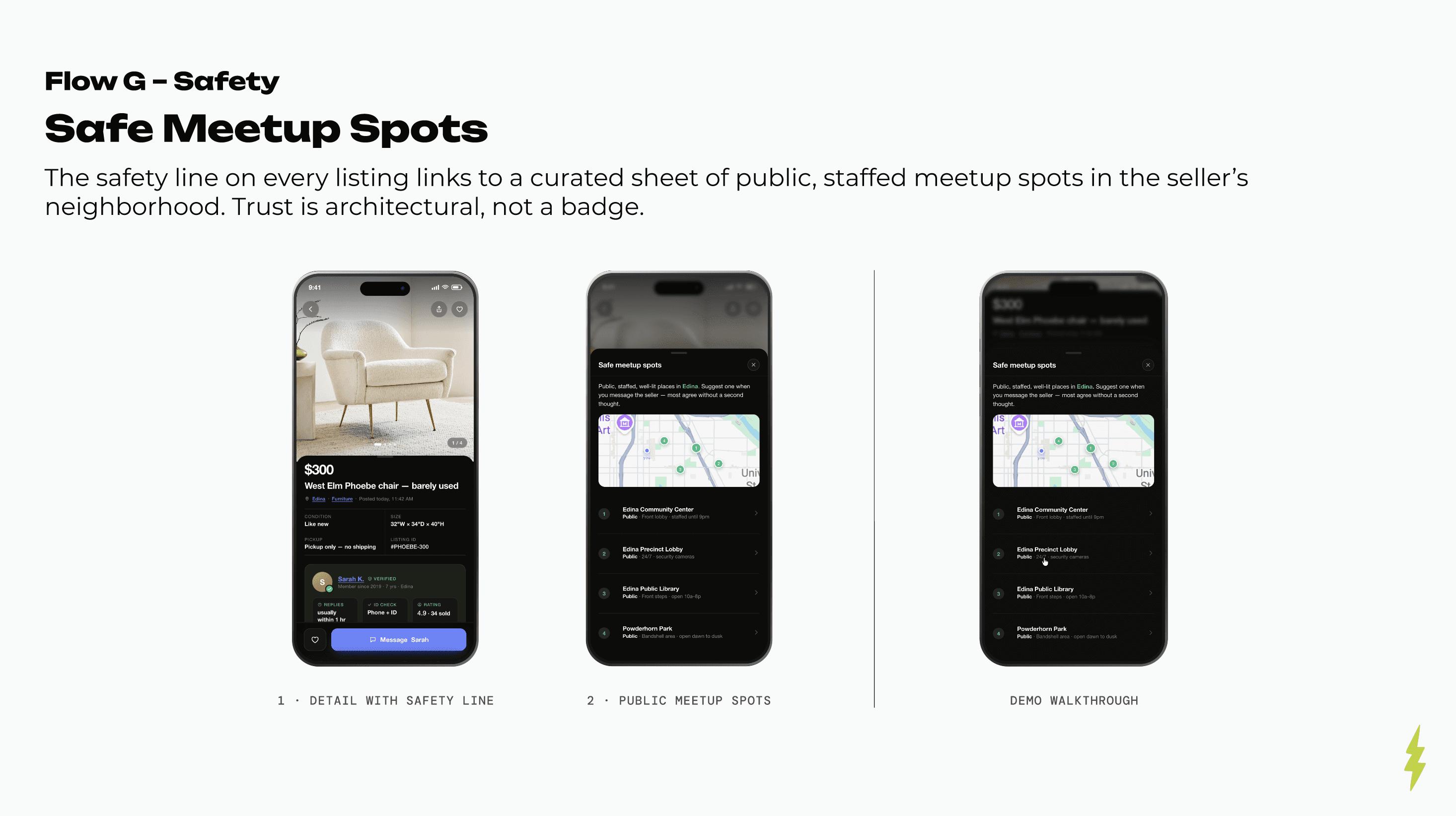
Your neighborhood is the default filter. • Location is always visible on Home, right under the search bar • Neighborhoods are underlined blue links, not tags • Public meetup spots suggested per neighborhood on the safety module
User Flows

Updated Design System
Lo/fi Wireframes
→ Home
The category directory and the location-first hero were fixed early. What changed across passes was giving the photo card room to breathe, and pulling the search bar up to overlap the hero so location and query read as one gesture.
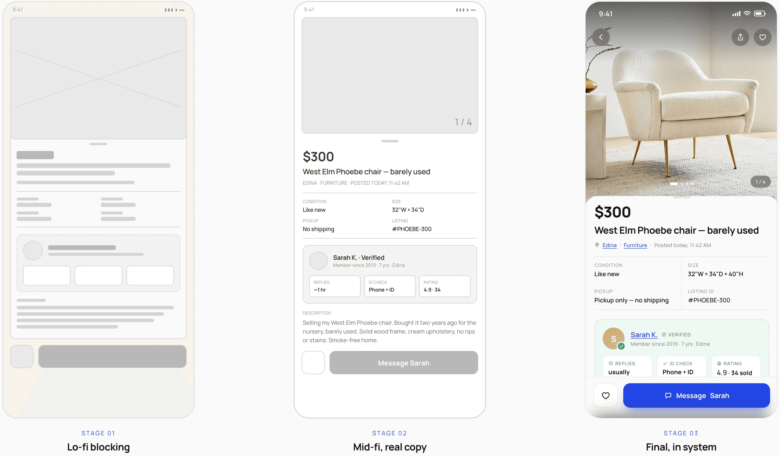
→ Browse
One listing card, designed once, reused on three screens. The lo-fi pass proved the row could carry price, two-line title, neighborhood, category, timestamp and a save action without crowding.
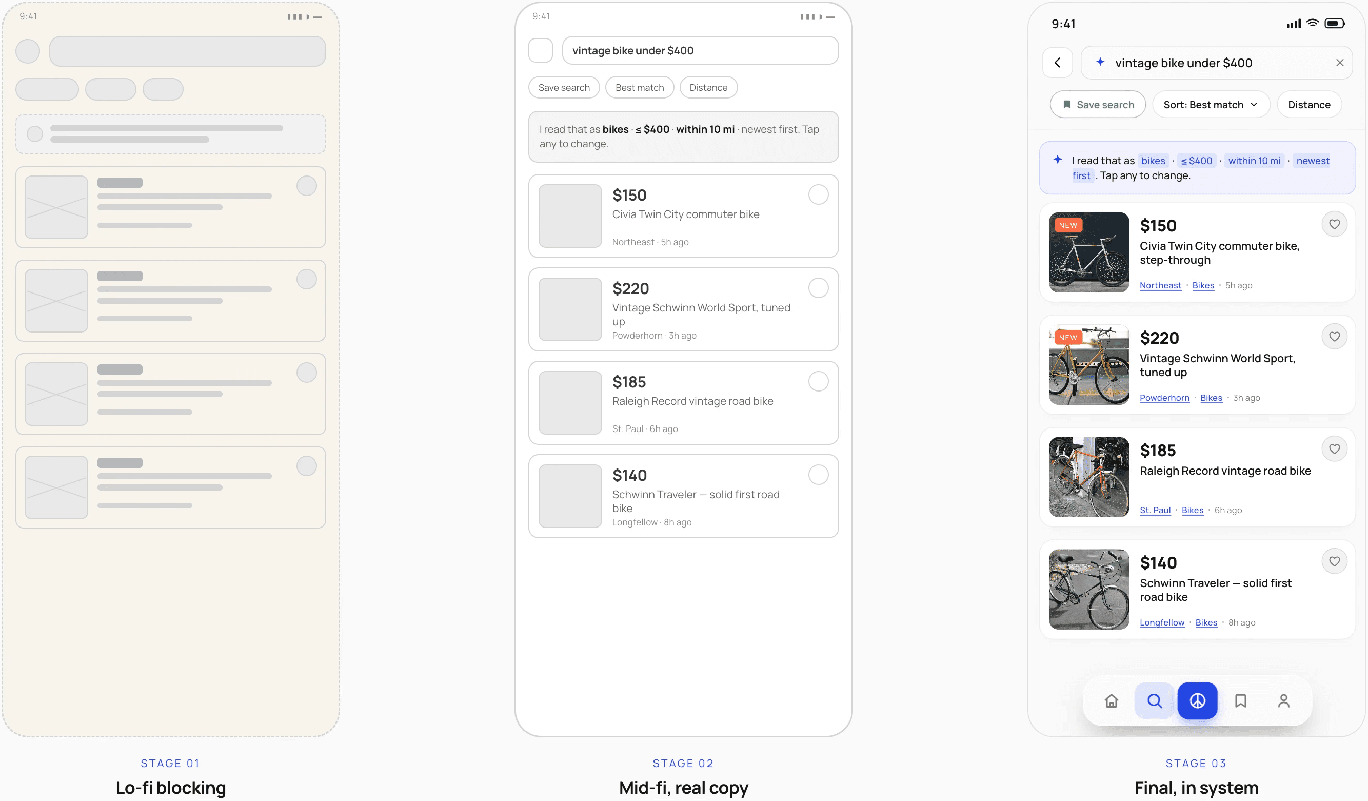
→ Search
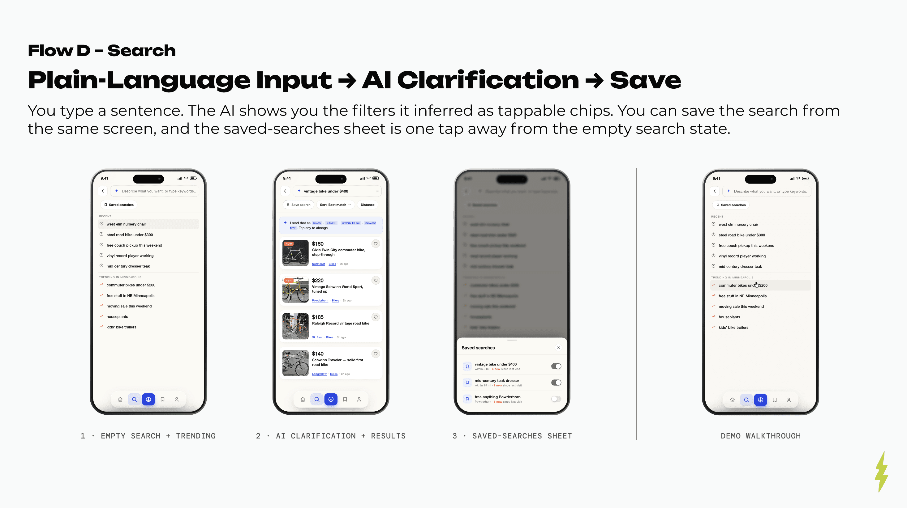
The hardest thing to wireframe was trust in the AI. The answer was structural: a persistent interpretation strip between the query and the results, holding the filters it inferred as editable chips.
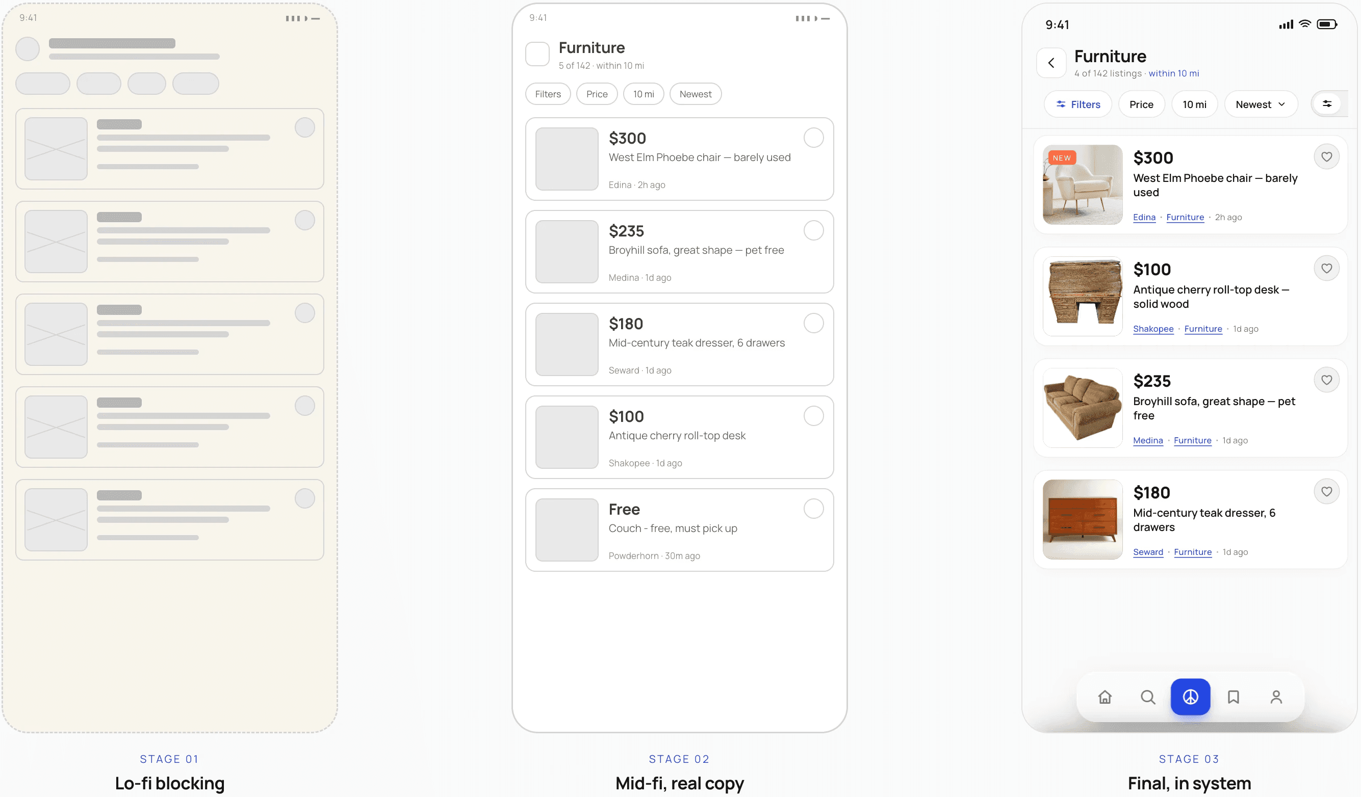
Designs
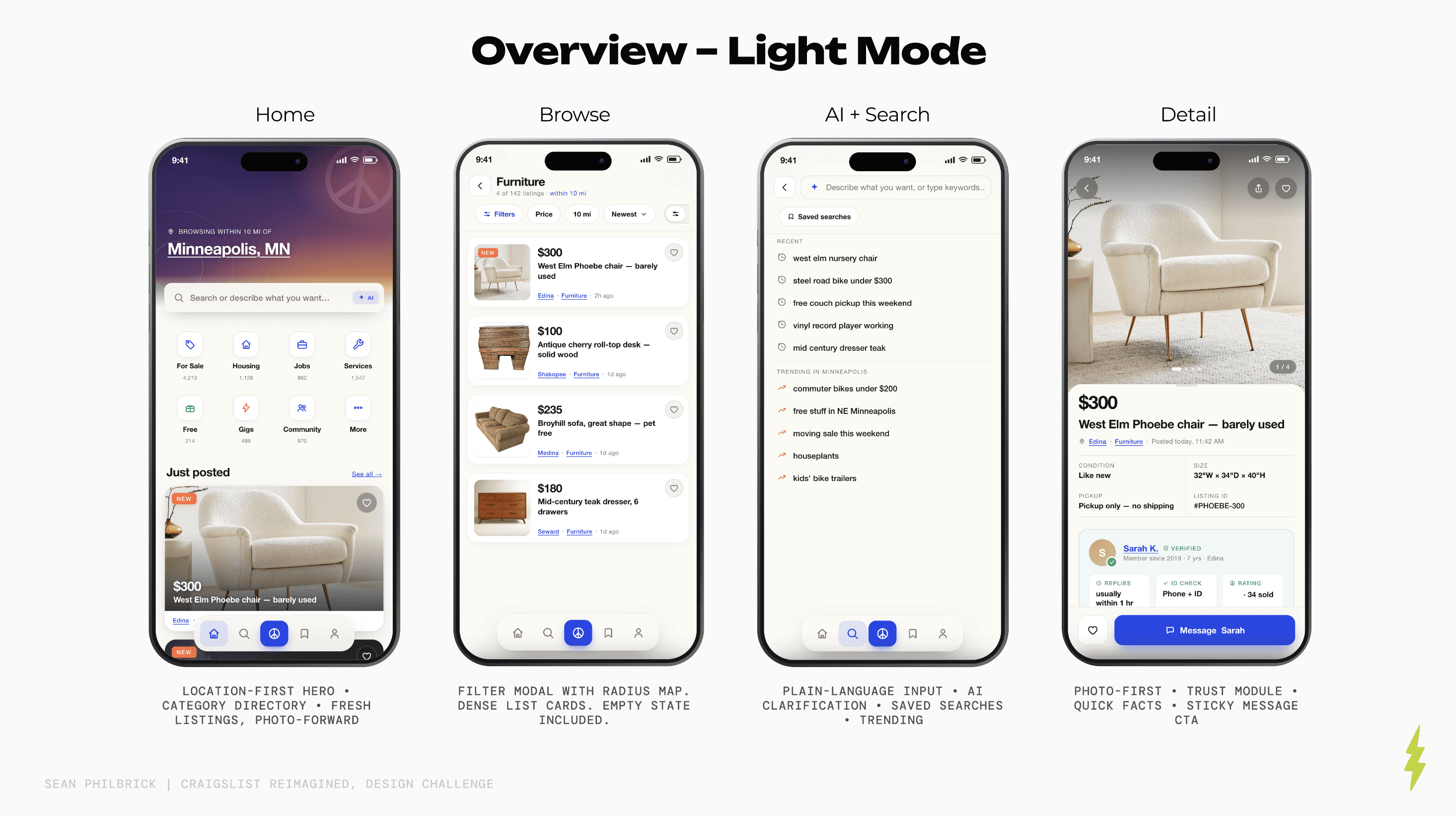
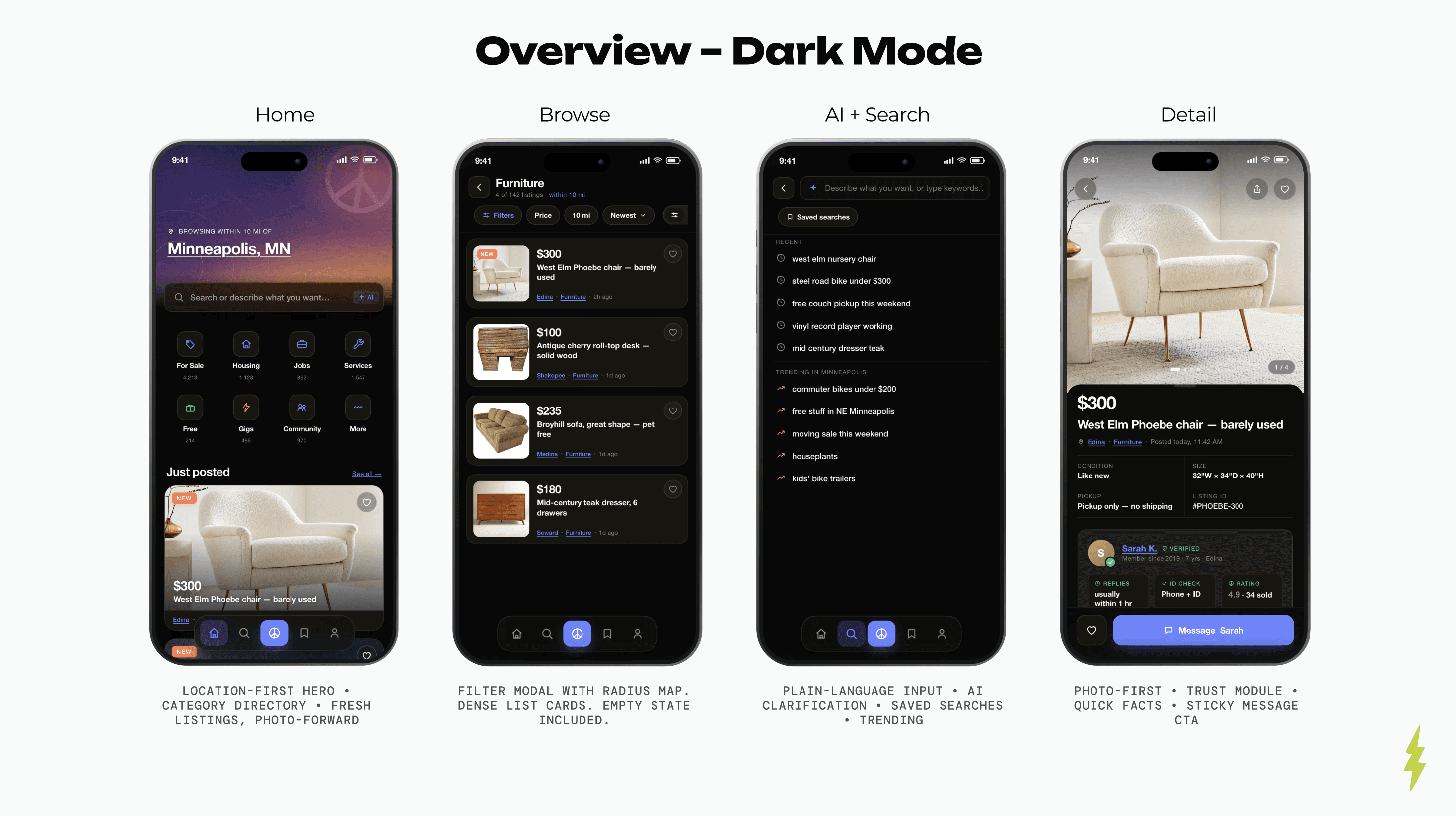
Unmistakably Craigslist

Solution
Modern structure layered onto plain-spoken honesty
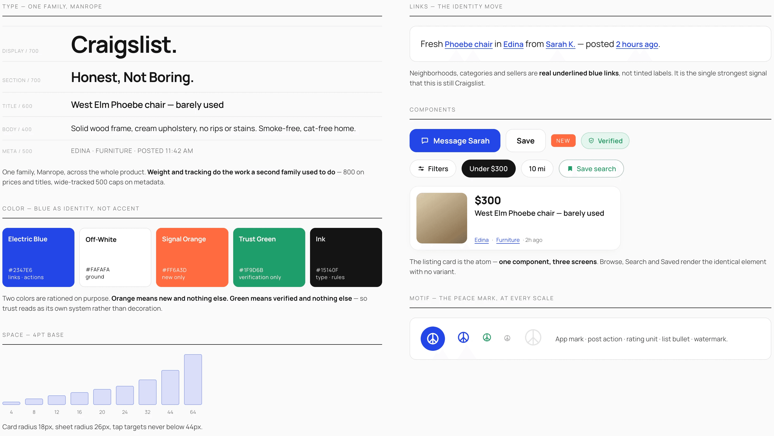
The redesign puts modern structure on top of Craigslist's honesty across eight flows. The design system holds it together: text-first density, real underlined links, mono metadata, and the peace mark at every scale – Helvetica Neue for hierarchy, JetBrains Mono for metadata. Craigslist Blue is an identity, not an accent. Trust Green does one job only, verification.
Trust, built in
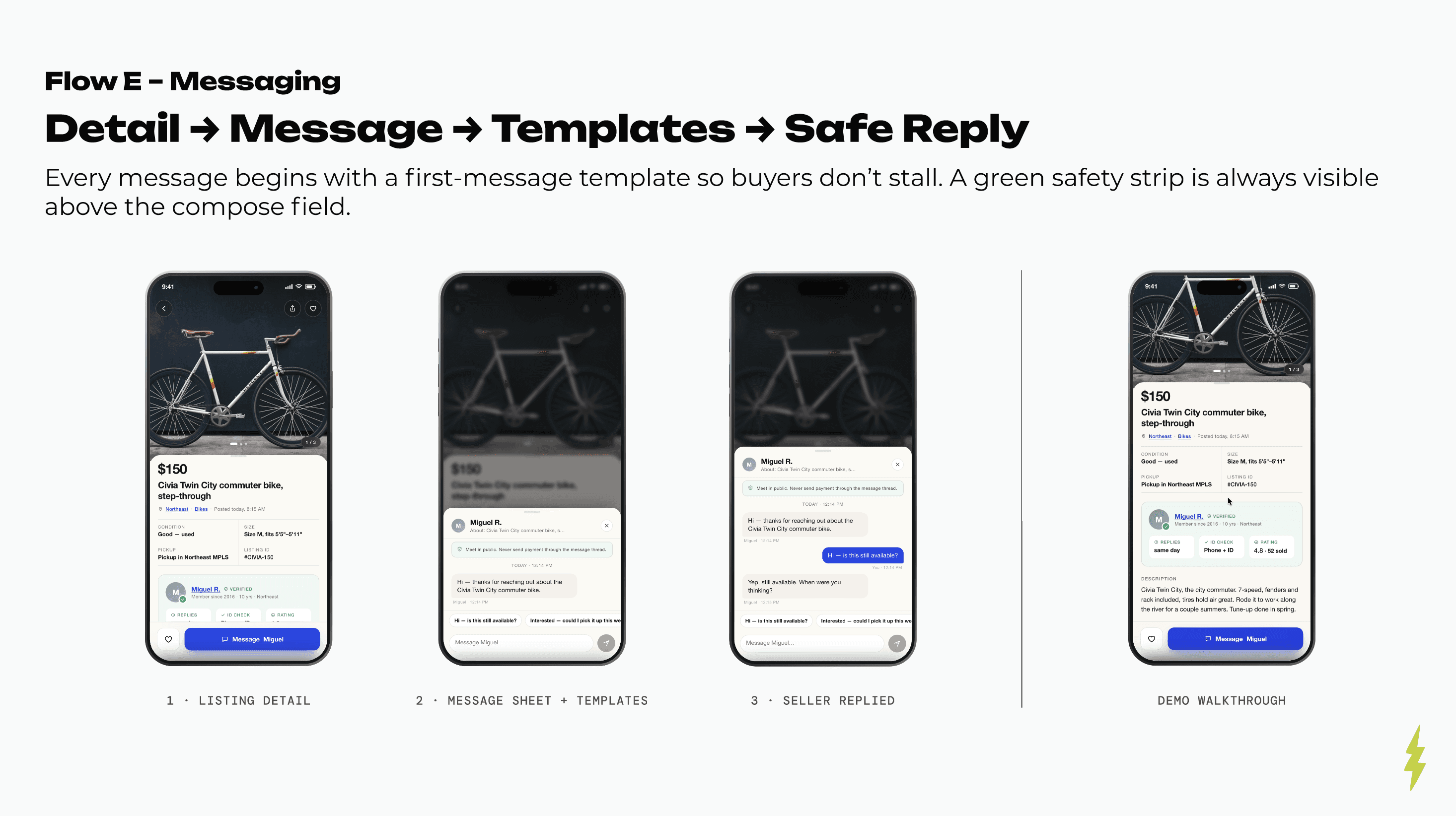
Instead of a policy page, safety is part of the structure. A trust module sits on every listing. A seller profile shows verifications, years on the platform, response rate, and a rating from real sales – one honest scroll. The safety line on each listing opens a set of public, staffed meetup spots in the seller's neighborhood. None of it needs new backend to design for.
Photo-first browsing
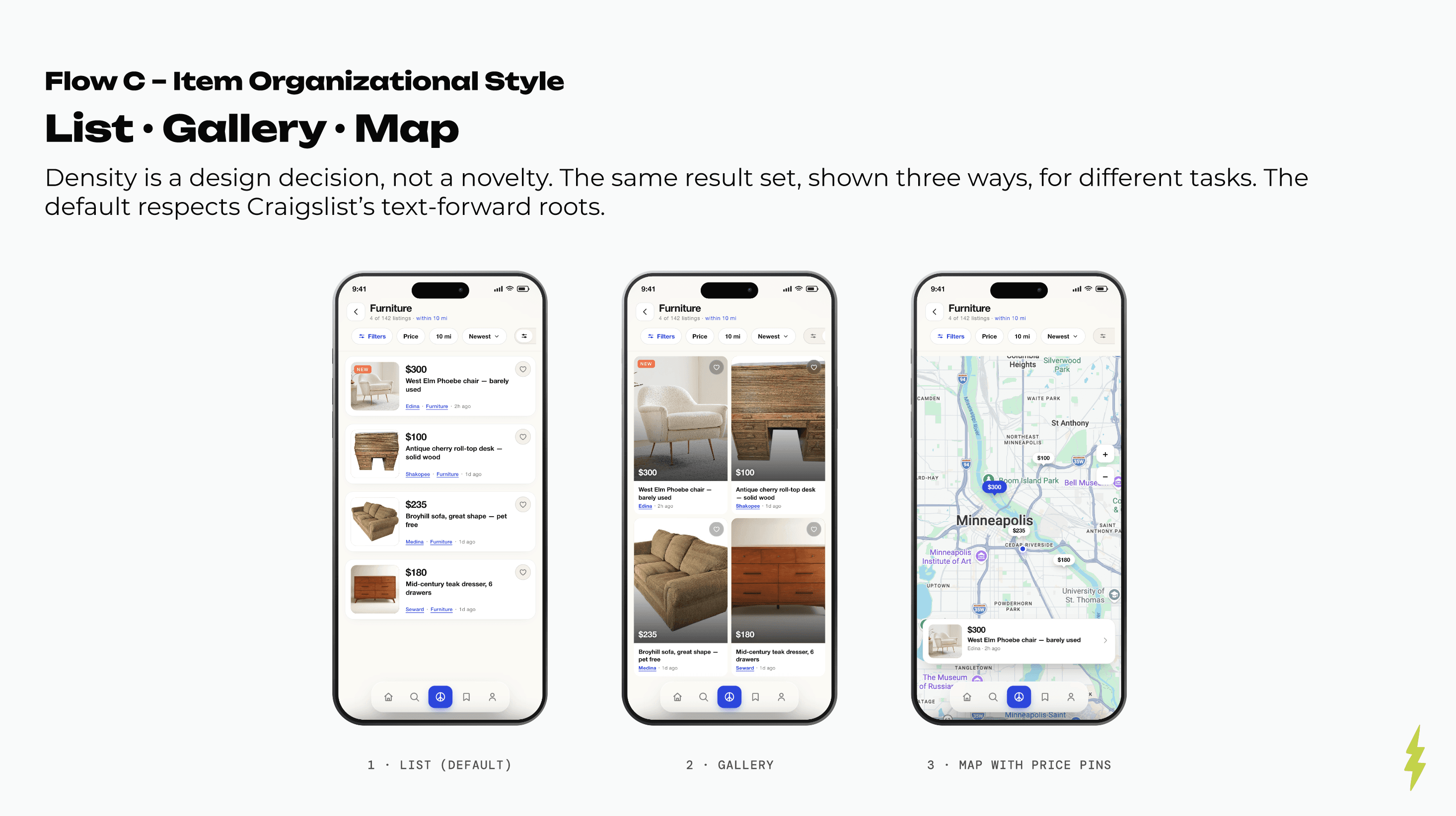
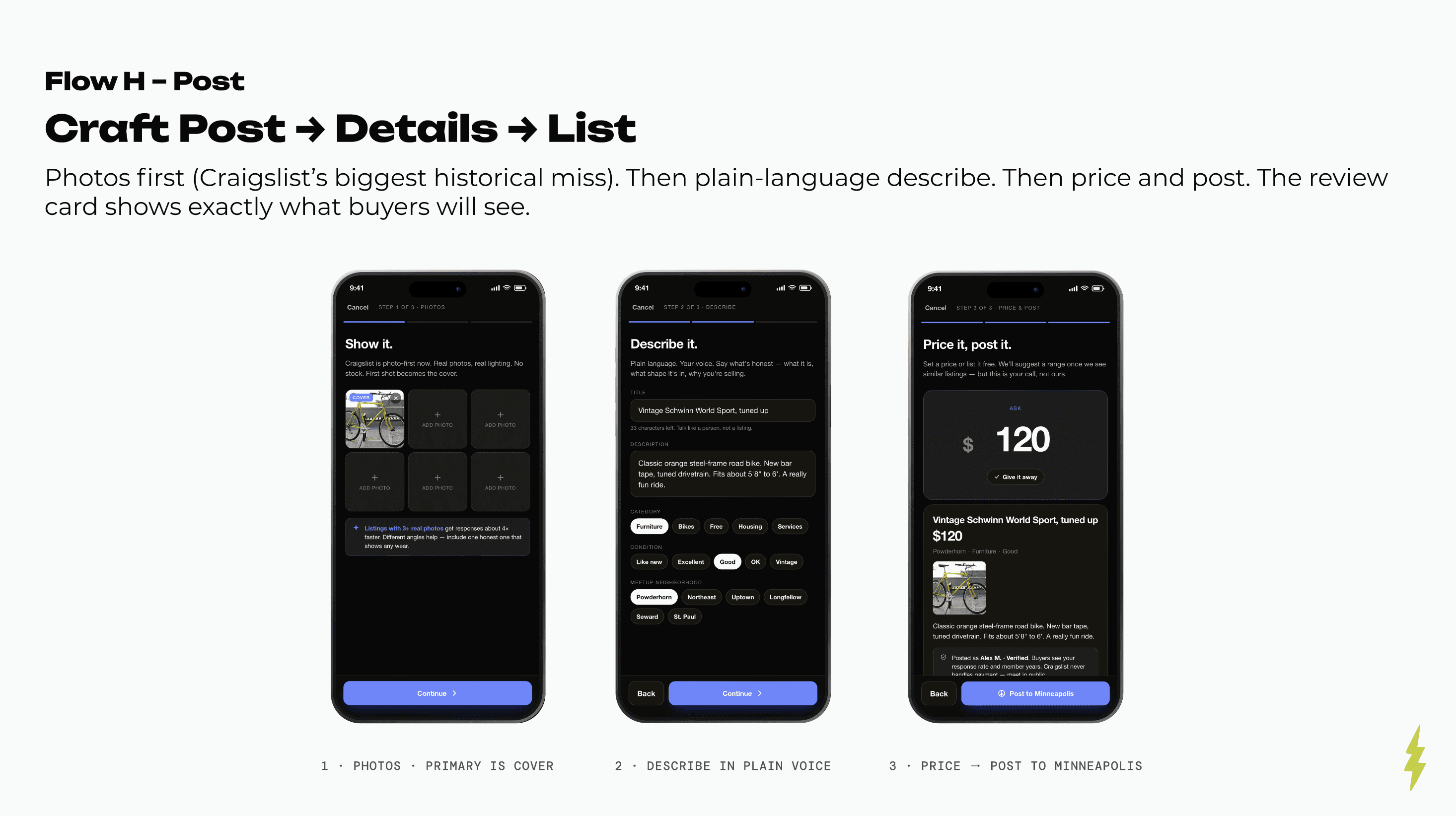
A card-based, photo-forward browse updates the feel right away without changing what Craigslist is – a list of stuff people are selling nearby. Same results, three ways: List, Gallery, and Map with price pins. The posting flow puts photos first (fixing Craigslist's oldest miss) then lets sellers write in plain language and see exactly what buyers will.
Smarter, lighter search
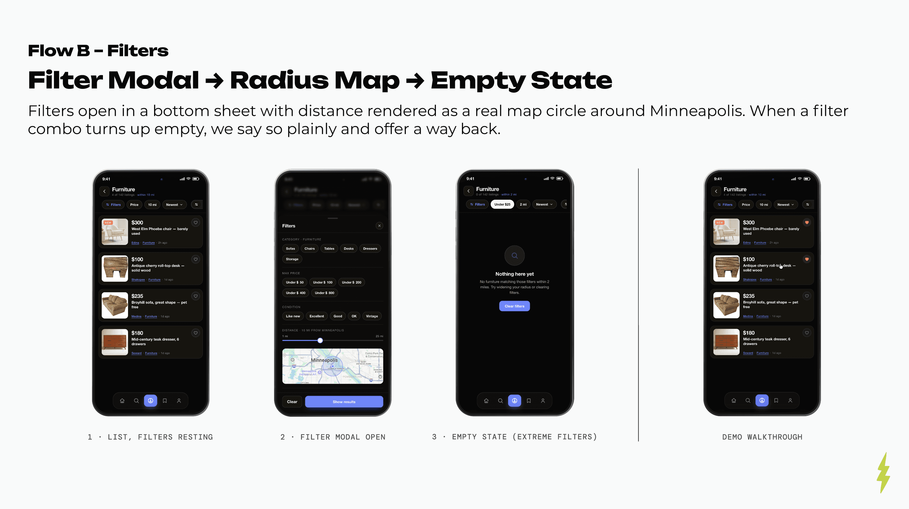
Search takes a plain sentence and shows the filters it picked up as chips you can edit – it tells you what it understood instead of hiding it. Saved searches stick and sit one tap from the empty state. Filter chips and a radius map that draws distance as a real circle around your city cut the "you have to know exactly what you want" friction. Nothing found? It says so and gives you a way back.
Retention through personalization
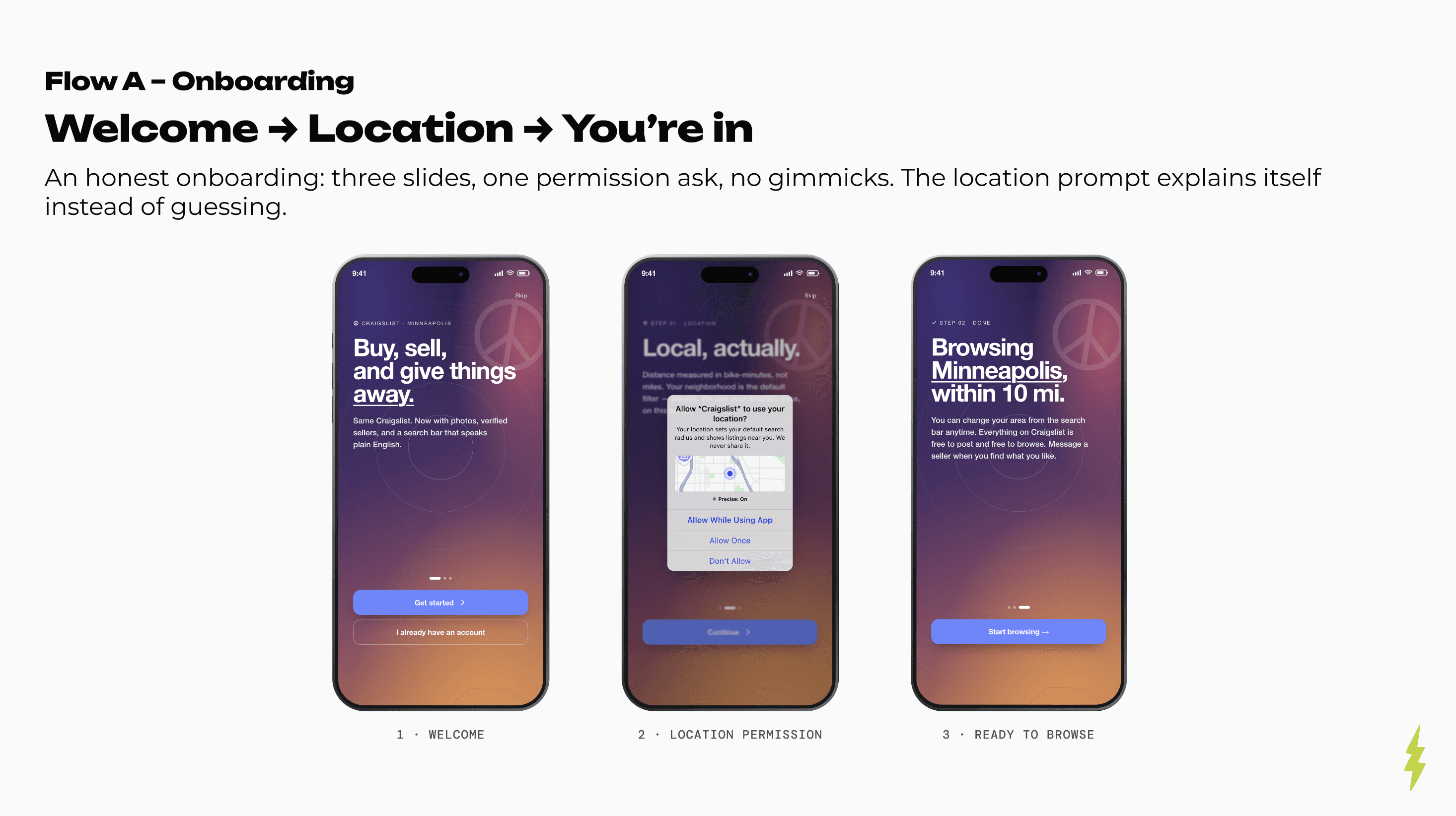
Saved searches and favorites give people a reason to open the app, something the website never did well. A three-slide onboarding asks for one permission, and the location prompt explains itself. Messaging starts every chat with a template so buyers don't freeze, with a green safety strip above the compose field.
Outcome
Recognizable to a longtime user, modern to a new one
It's self-initiated, so there are no shipped metrics — the thinking is the point. Every decision traces back to a user insight and a business cost, and it all answers to one idea: Craigslist's value is its honesty, and the redesign has to make that honesty easier to see, not trade it away for polish.
The result is a marketplace a longtime user would still recognize but a first-timer would find modern and easy. Modern structure, same brand. That was the whole point.
Lessons
The hard part wasn't the UI, it was the discipline
It's easy to redesign Craigslist into something sleek and generic. The constraint I set was that every modern element had to earn its place against the brand, not just look good on its own. Writing the three principles first (Plainspoken, Transparent, Local) is what made that doable. They turned "modernize without going generic" from a vague goal into a filter I could run every screen through.
It also backed up something I believe: strategy and craft aren't separate steps. The research, the business case, the principles – those weren't before the design work, they were the design work. The screens are just where it all shows up.