Hyperlite Mountain Gear
Elevating a site to reflect its premium gear
Design Challenge: The products are premium. The site had room for improvement. This was a self-initiated redesign to fix that, built on a system that keeps it fixed as the catalog grows.

Overview
A premium gear brand with a website that didn't match
Hyperlite Mountain Gear makes some of the most respected ultralight backpacks and shelters in the outdoor world – seriously strong, seriously light, and built for people who take the backcountry seriously. The brand idea is simple: carry less, go further.
The website had room for improvement to live up to the quality of their products. The products were premium, but the digital experience wasn't keeping up. So I treated it as a systems problem and owned the whole thing: the audit, an update to the design system, and a redesign of the three pages that matter most.
Challenge
A simple site with room for improvment
The site had good instincts — clean layouts, strong product photos, a restrained look. But underneath, a few structural things created friction for users and for the team maintaining it.
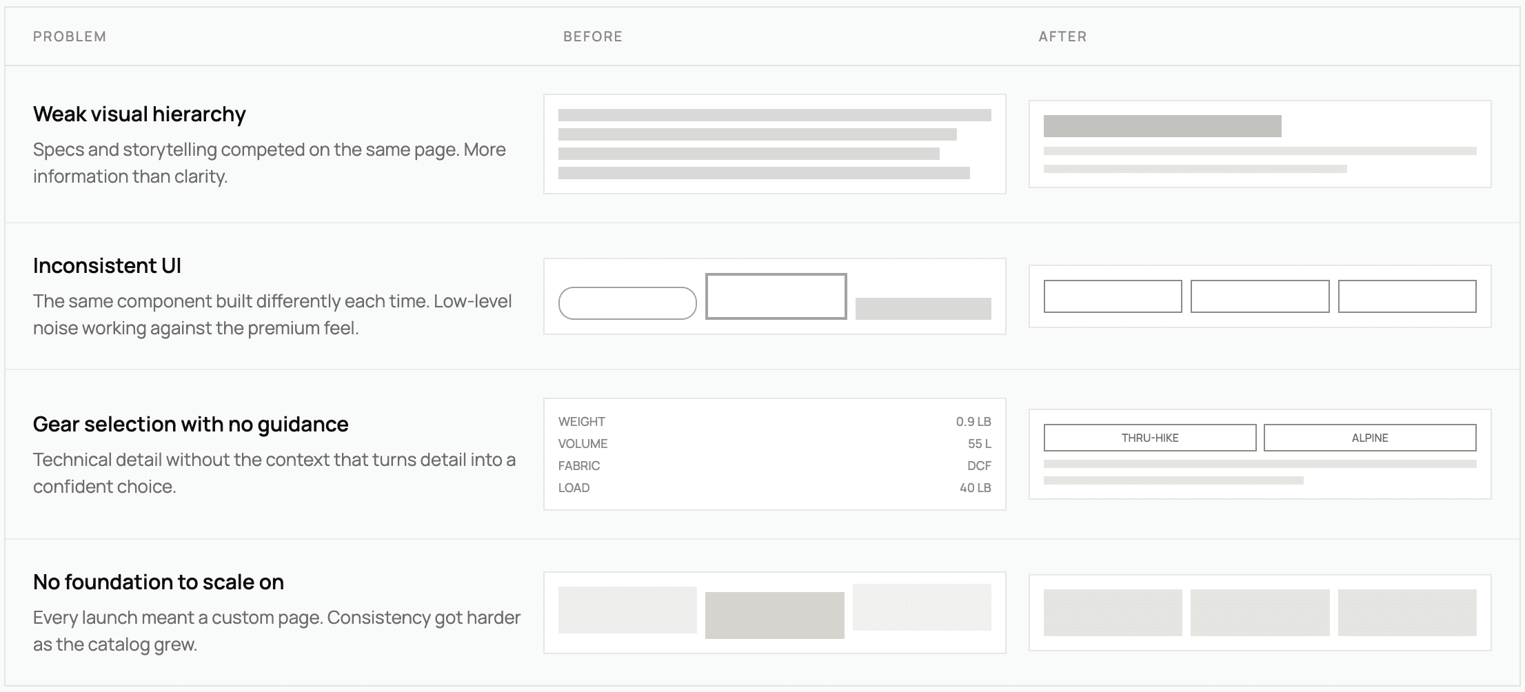
Weak visual hierarchy
Product grids and spacing made scanning hard. Specs and product storytelling fought for attention on the same page instead of working together, so users got more information than clarity.
Inconsistent UI
The same kind of component showed up built a little differently each time. Buttons, product cards, and content modules weren't standardized, which added a low-level visual noise that worked against the premium feel.
Gear selection with no guidance
The product line is technically dense. Someone choosing between packs or shelters needs help figuring out which one fits their trip — not just a spec sheet. The site leaned on technical detail without the context that turns detail into a confident choice.
No foundation to scale on
Every new launch meant a custom page built from scratch. With no shared system, keeping things consistent got harder as the catalog grew.
And they fed each other. A fragmented UI made the technical content harder to read, and no design system made every inconsistency harder to fix.
Approach
Design the system first, and let the brand ethos be the brief
The brand as the brief
I didn't start with the UI, I started with the brand. "Carry less, go further" is a design brief hiding in plain sight: cut everything down to what's essential, and make what's left work harder. I used it as a filter for every decision. If an element didn't earn its place, it was gone.
System before screens
Since scalability was one of the actual problems, I built the foundation first (type scale, color tokens, spacing, and a component library in the brand's visual language) before designing a single page. That way every page was already part of a system instead of a one-off.
The pages that matter most
Instead of a full-site redesign, I focused on the three highest-impact pages: homepage, collection, and product detail. Those are the moments where someone decides to trust the brand, narrow their options, and buy. Getting those right on a shared system had the most payoff.
Specs vs. clarity
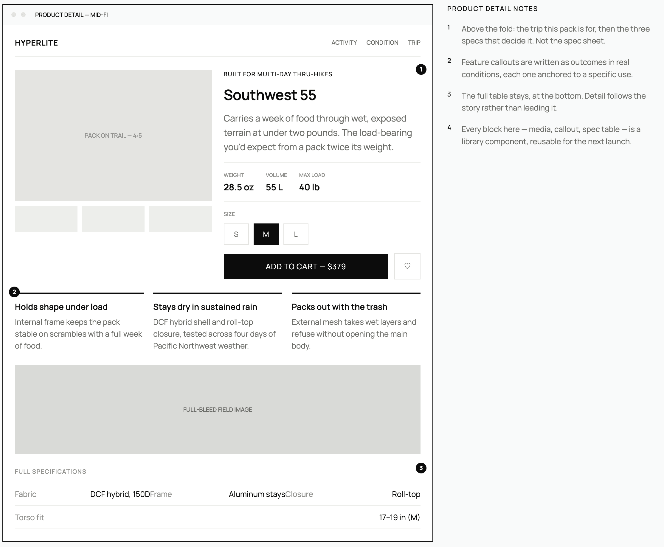
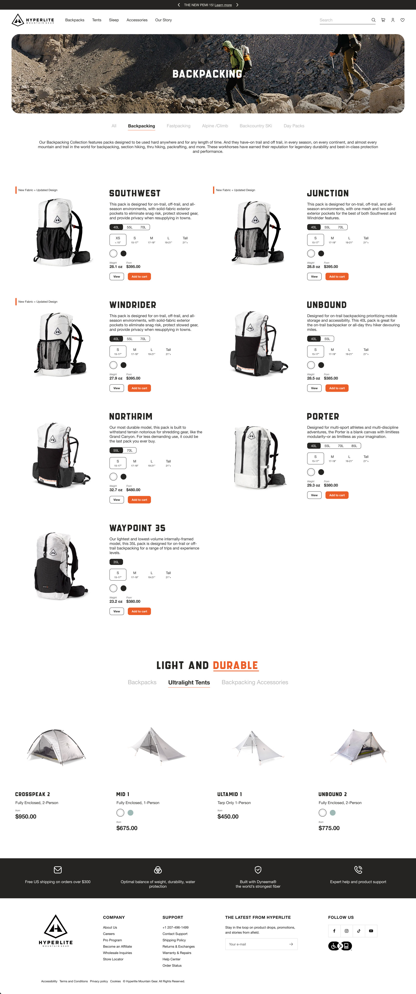
Ultralight buyers know their stuff and want the detail. But a raw spec list doesn't help you choose, it just piles on. So I worked out where each level of detail belongs: scannable on collection pages, deeper and in context on product pages, and always tied to real-world use instead of numbers in a vacuum.
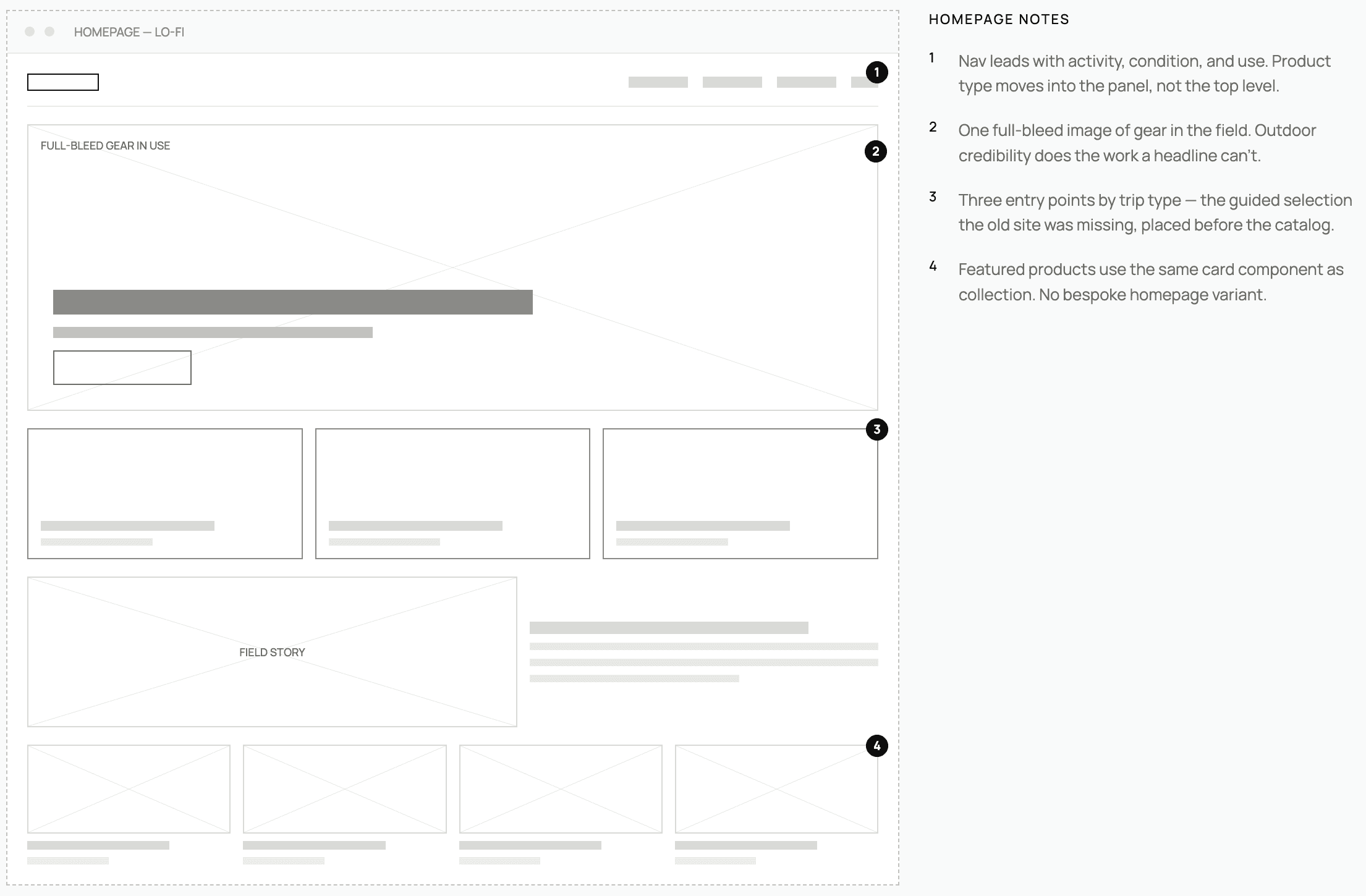
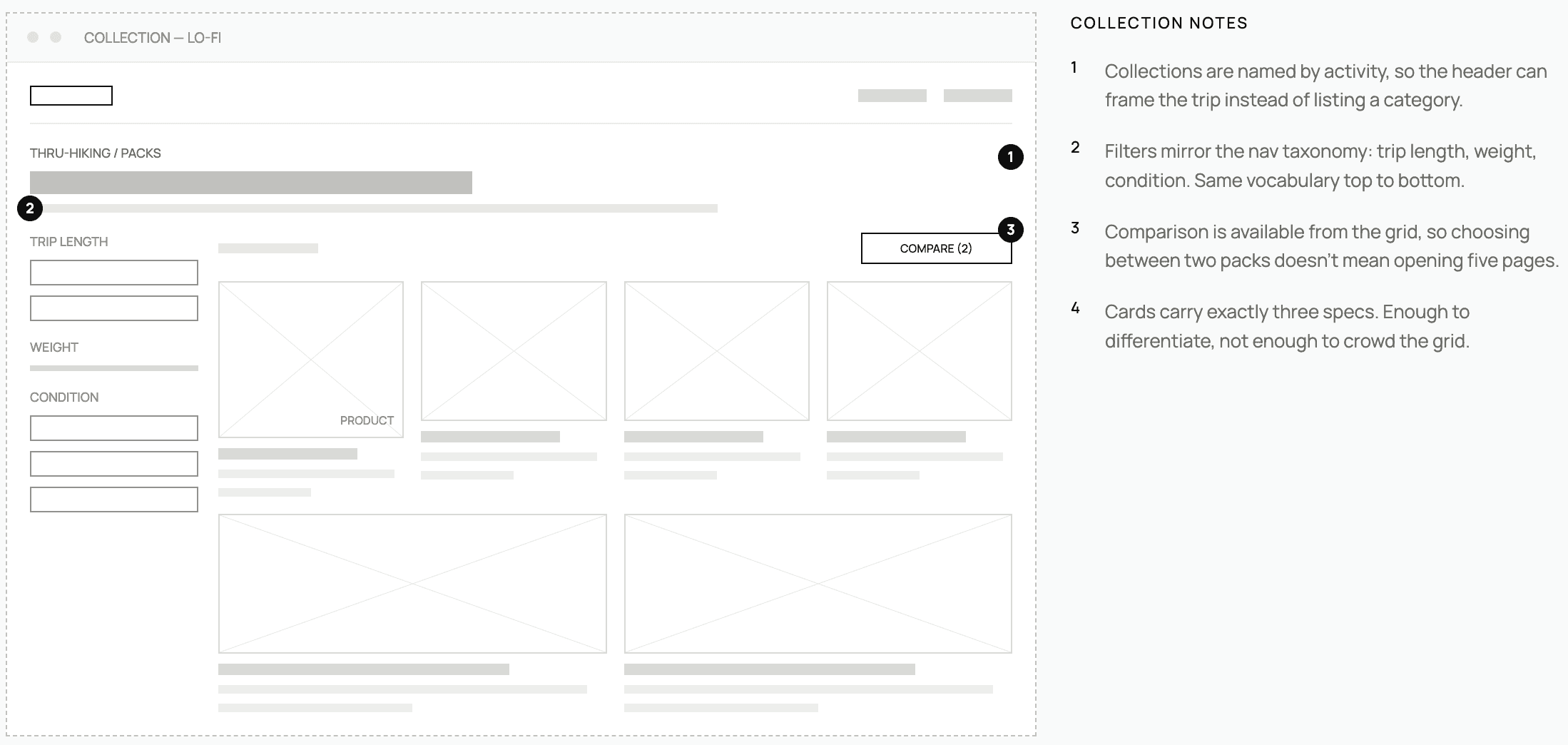
Lo/fi Wireframes
Solution
A cleaner store, built on a system that scales
A design system built for the brand
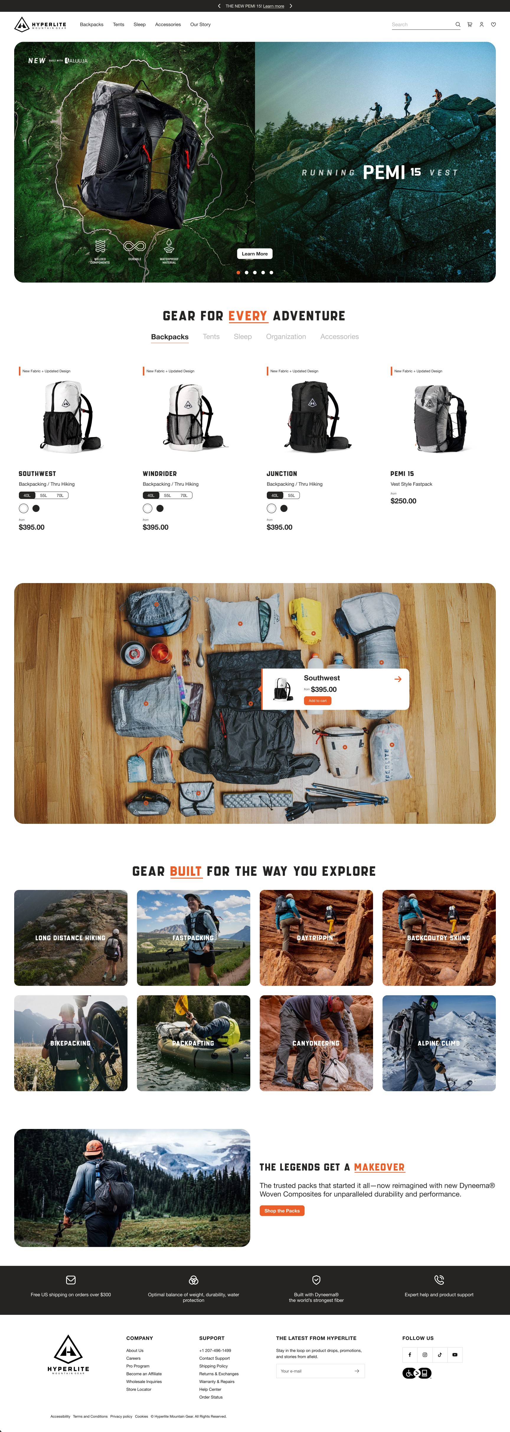
A modular system grounded in the minimalist philosophy. Clear type hierarchy for scanning products, a neutral palette that lets the gear photos lead, consistent spacing and layout logic, and standard components like product cards, spec modules, and feature highlights. It's built so the team can ship new pages faster without losing consistency.
Simpler product discovery
I restructured navigation around how people actually think about gear (by activity, condition, and use) instead of internal product categories. Better filtering and clearer comparison tools give people the scaffolding to decide without cross-referencing five pages.
Better product storytelling
Product pages now lead with what earns trust: real-world context, performance credentials, and feature callouts tied to specific uses. The tech specs are still there, they just follow the story instead of leading it. Bigger, more intentional imagery carries the outdoor credibility throughout.
Consistent, scalable pages
Homepage, collection, and product pages are all built from the same components – visual consistency across the experience, and a reusable blueprint for the next launch.
Hi/fi Designs
→ Home
→ Product Collection Page
Outcome
Built to stay consistent as the catalog grows
It's speculative, so there are no shipped metrics, the thinking is the point.
The redesign comes down to one idea: a brand that makes uncompromising products deserves a digital experience held to the same standard. Every decision, from the type scale to the spec module, was in service of that.
Lessons
The best design brief was the brand's own philosophy
The most interesting constraint was one I set myself: treating the brand philosophy as a design system principle, not just a brand guideline. "Carry less, go further" made me question every element. Is this earning its place, or is it just there? That produced cleaner decisions than I'd have made otherwise.