Specialized Bicycle Components
Architecting an enterprise-level design system
"Sequoia" is the unified design system for Specialized Bicycle Components. It was created to replace three independent, overlapping legacy systems with a single, scalable source of truth across design and engineering. It covers the full Specialized digital ecosystem: the consumer app, e-commerce platform, and B2B platform.

Overview
The unified design system behind Specialized's entire digital ecosystem
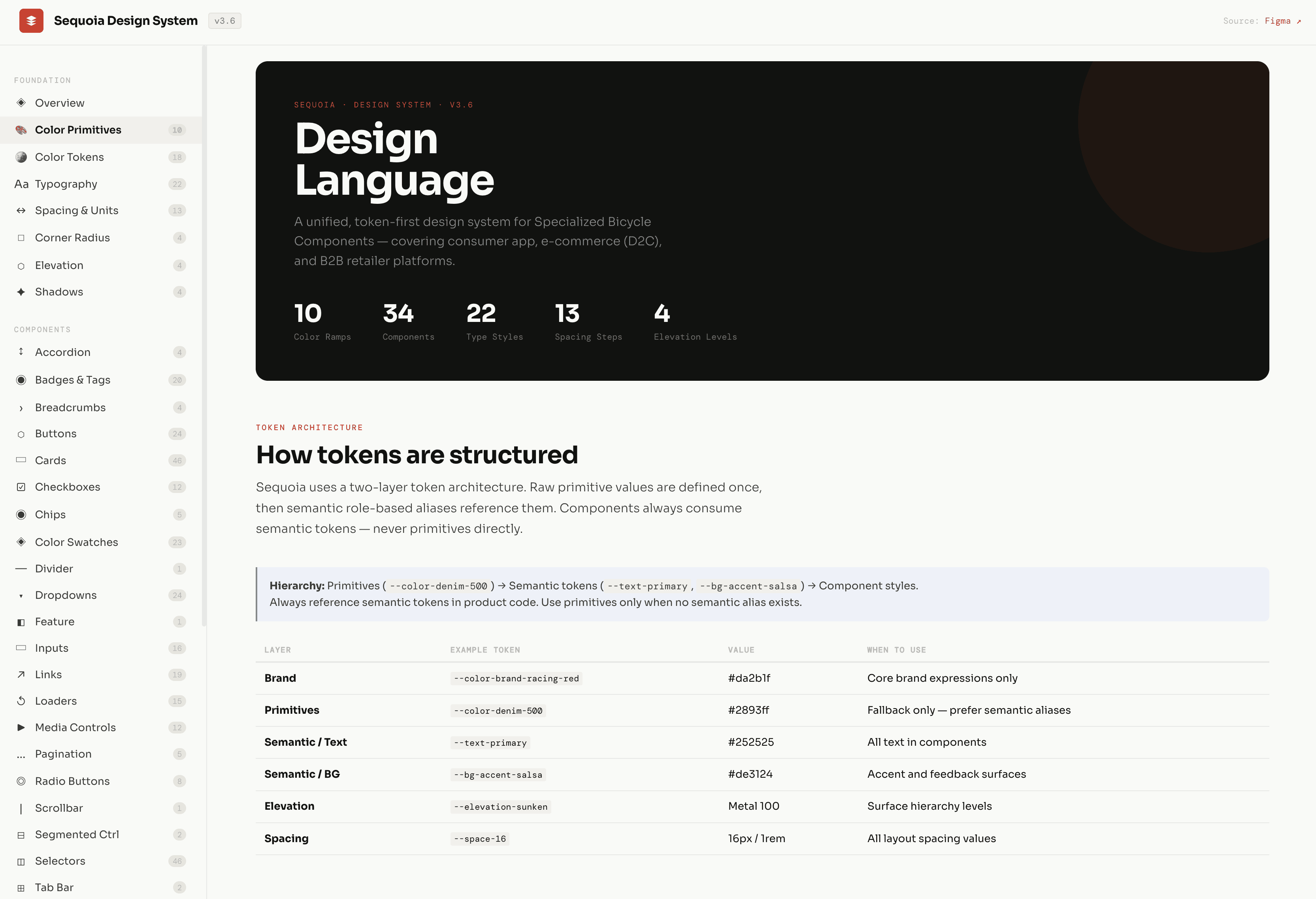
Sequoia covers just about everything Specialized ships digitally (the consumer app, the e-commerce site, and the B2B retailer platform) serving 13+ product teams. It has 35+ components (including 200+ variants), 120+ design tokens/variables, patterns, foundational elements (primitive colors, type system, elevation), and usage guidelines to support scalable implementation across the entire company. It's the biggest and most sustained systems project I've worked on.
Challenge
Three parallel libraries were compounding design debt with every release
As Specialized digital platforms grew, the design system side didn't keep up.
Fragmented foundations
• Three libraries, overlapping components, no shared tokens • Naming and file structure were different in each one • No governance. A change in one library never made it to the others
Design-to-code misalignment
• Figma and the actual code had drifted apart • Different engineering teams kept rebuilding the same components • No shared docs for how a component worked or when to use it
Scaling friction
• Any brand update meant hand-updating all three libraries and their codebases • Starting a feature meant picking a library to work from — and usually building a one-off instead of reusing what was there • The inconsistencies piled up every release
This wasn't just about looks. Fragmented systems slow everyone down, make people stop trusting the tools, and get harder to keep clean as the product grows. That's what Sequoia was built to fix.
Approach
Audit before design, tokens before components, governance before adoption
Audit first, no assumptions
Before designing anything, I inventoried all three libraries (every component, token, pattern, and state, across every platform). Then I checked the design files against the shipped code to see where the two had drifted. That gave me two things: a clear read on what could be merged, and a sense of which components were doing real work versus just sitting there. It also put the whole problem in front of the team in one place, which is what got everyone on the same page before I proposed anything new.
Tokens before components
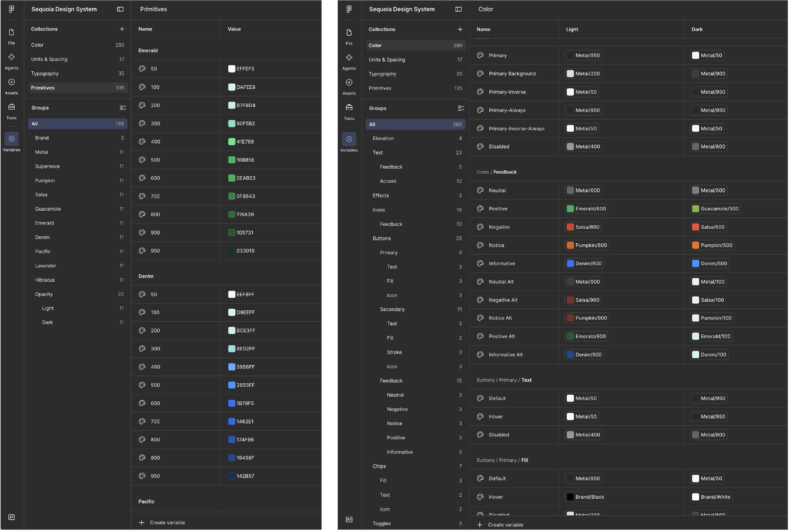
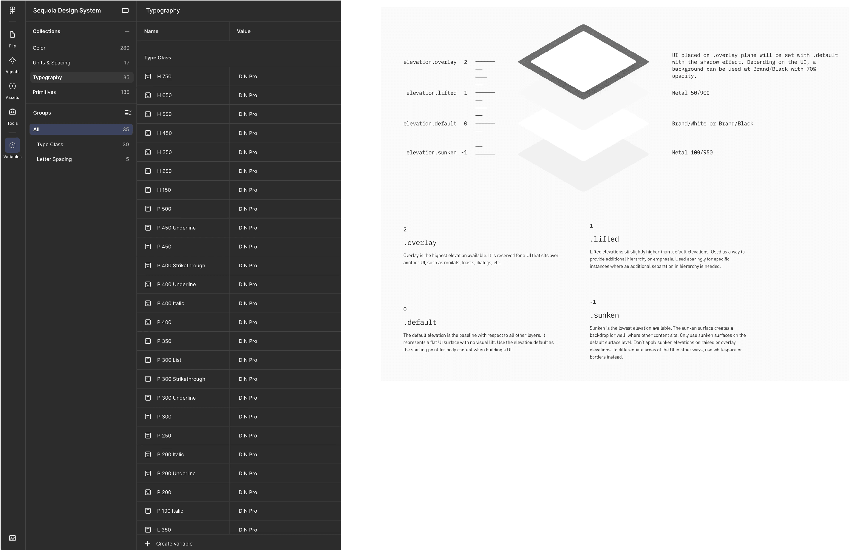
I built the token layer before touching a single component. Color, type, spacing, elevation – all defined as global tokens and mapped to Figma variables, so design and code could finally speak the same language. That order was on purpose. Tokens are the hardest thing to go back and change, and the most expensive to get wrong. Build components on a shaky token layer and you just recreate the same mess one level up.
Component rationalization
With tokens in place, I merged the duplicate components into clean, variant-based ones — cutting the extra permutations while keeping the flexibility teams actually used. Everything got standardized: interaction states (hover, focus, active, error, loading), naming, file structure. Accessibility was built into the base, not bolted on later.
Design-engineering alignment
I worked with engineering the whole way, not just at handoff. Regular design/dev syncs on each platform let us catch feasibility problems and drift early. We discussed how to migrate off the old libraries and plan for adopting the new system in a manner that made sense to their current workload and timeline. The goal was Figma and code matching 1:1.
Governance and adoption
A system with no governance falls apart. So I set up release notes, syncs to review changes, and versioning process — a clear way for teams to propose, check, and ship updates. Then I ran rollout sessions across design and engineering to get people onto it, wrote up how to migrate off the old libraries, and made Sequoia the official source of truth.
Solution
One token layer, one component library, one governed system
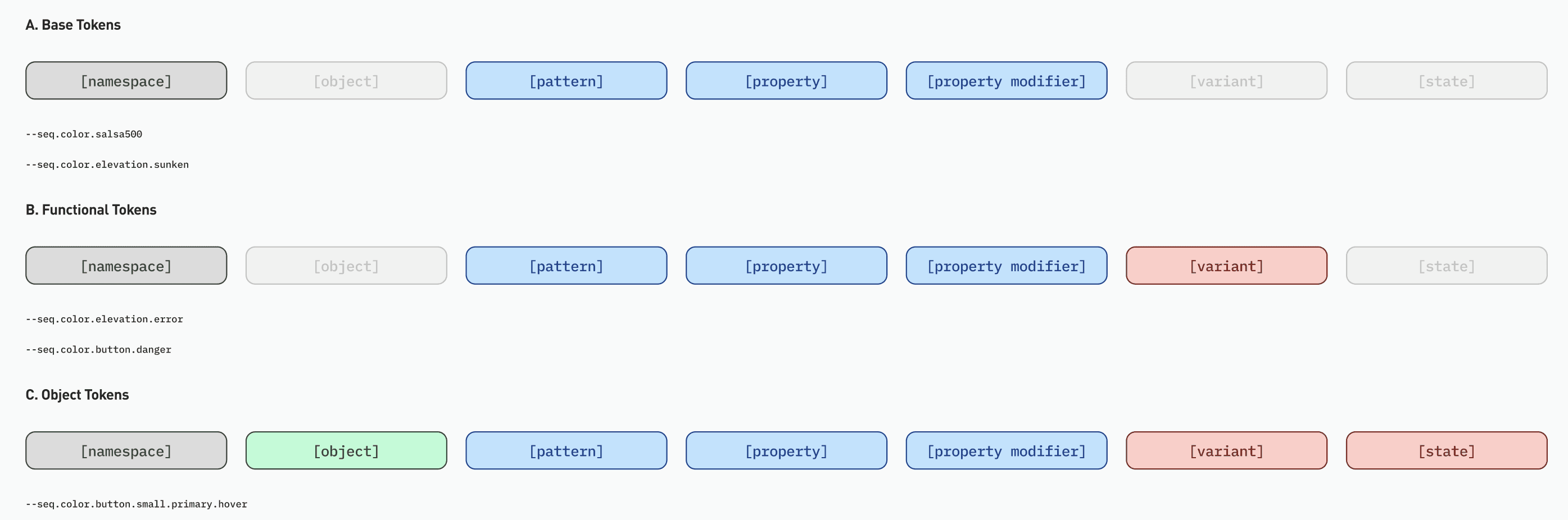
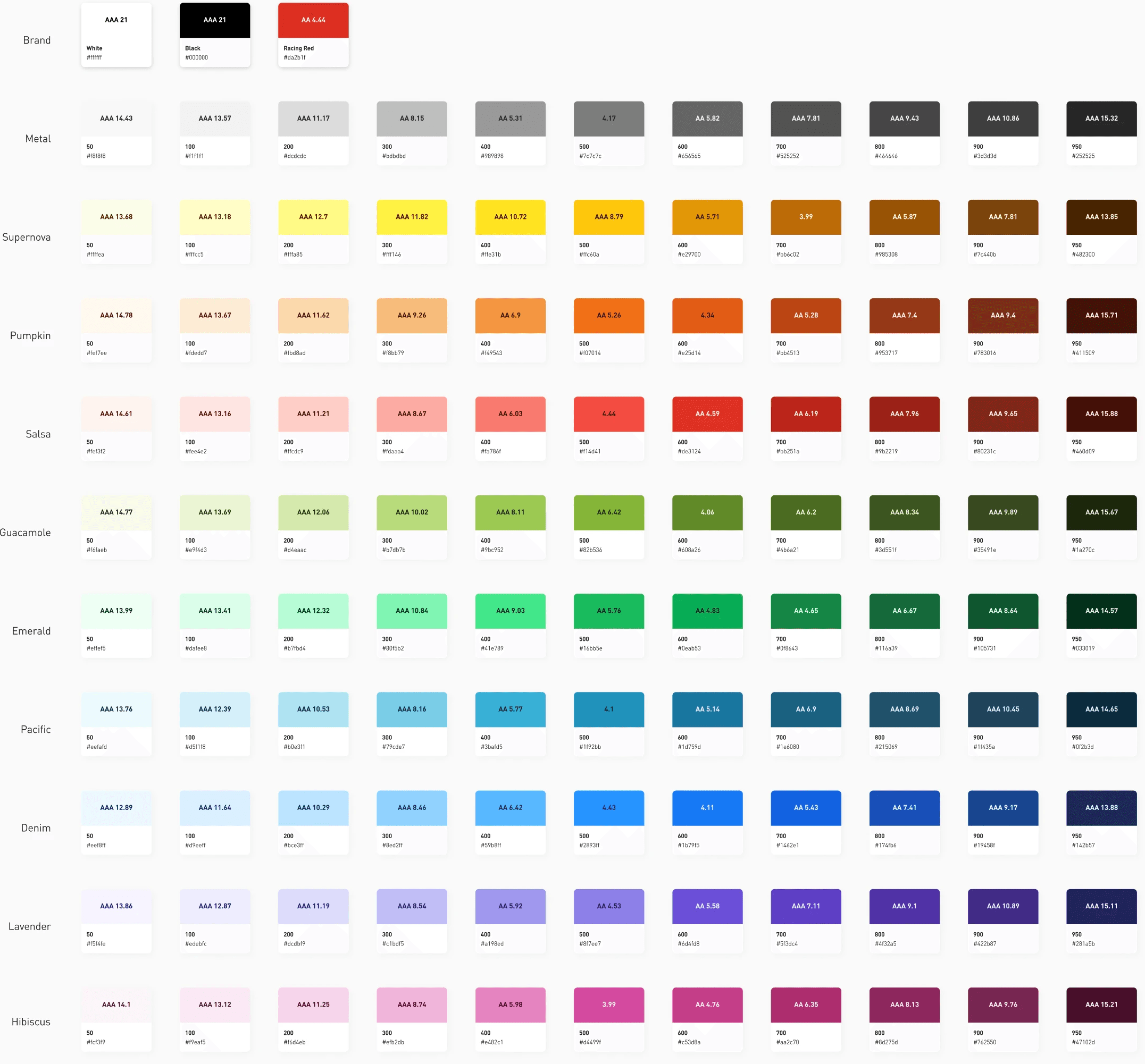
A unified token layer |
|---|
Global tokens (color, type scale, spacing, elevation) mapped to the engineering variables across platforms. Change one token and it updates everywhere it's used, so brand updates stopped being a manual slog across three libraries. |

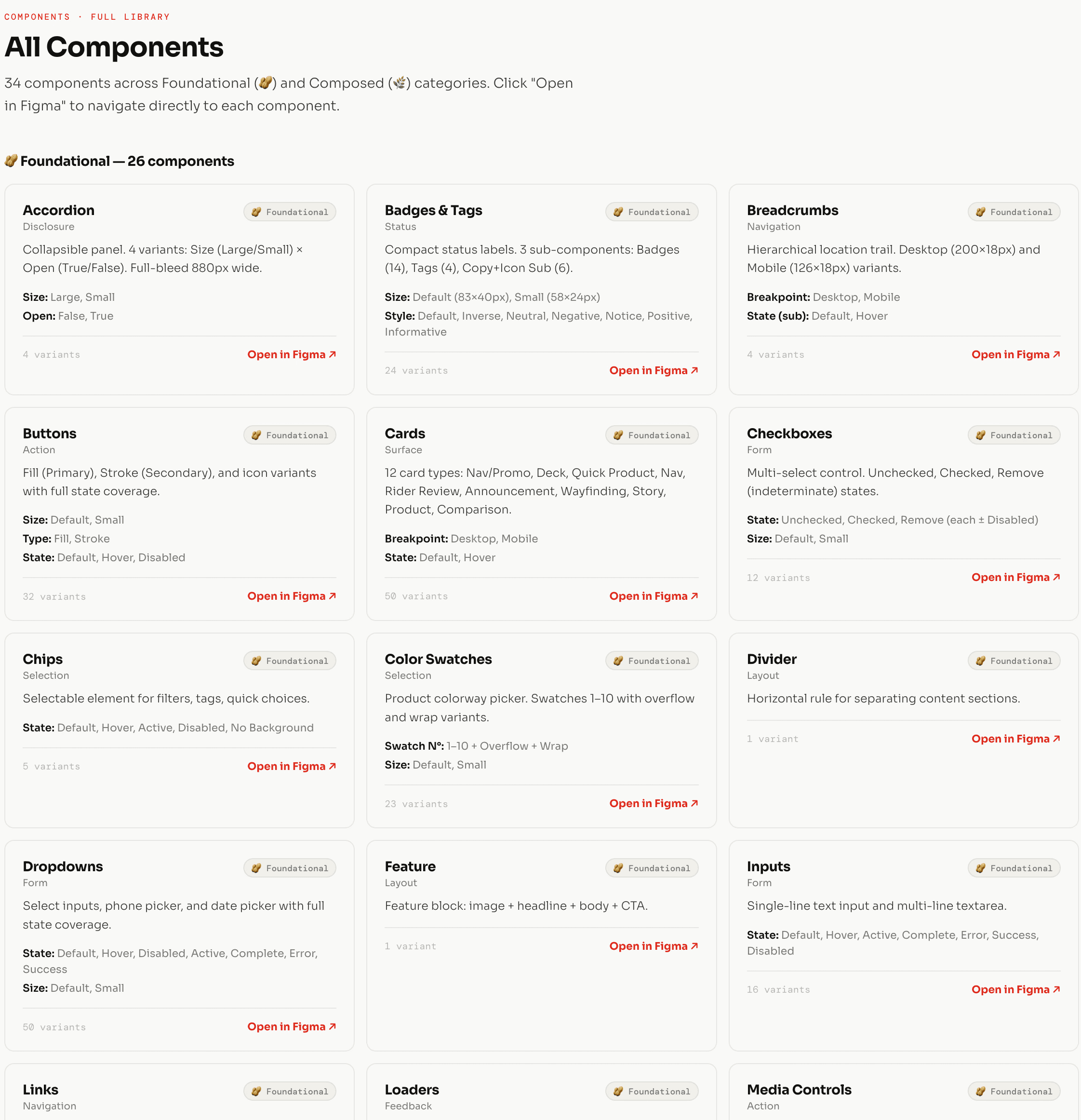
A rationalized component library |
|---|
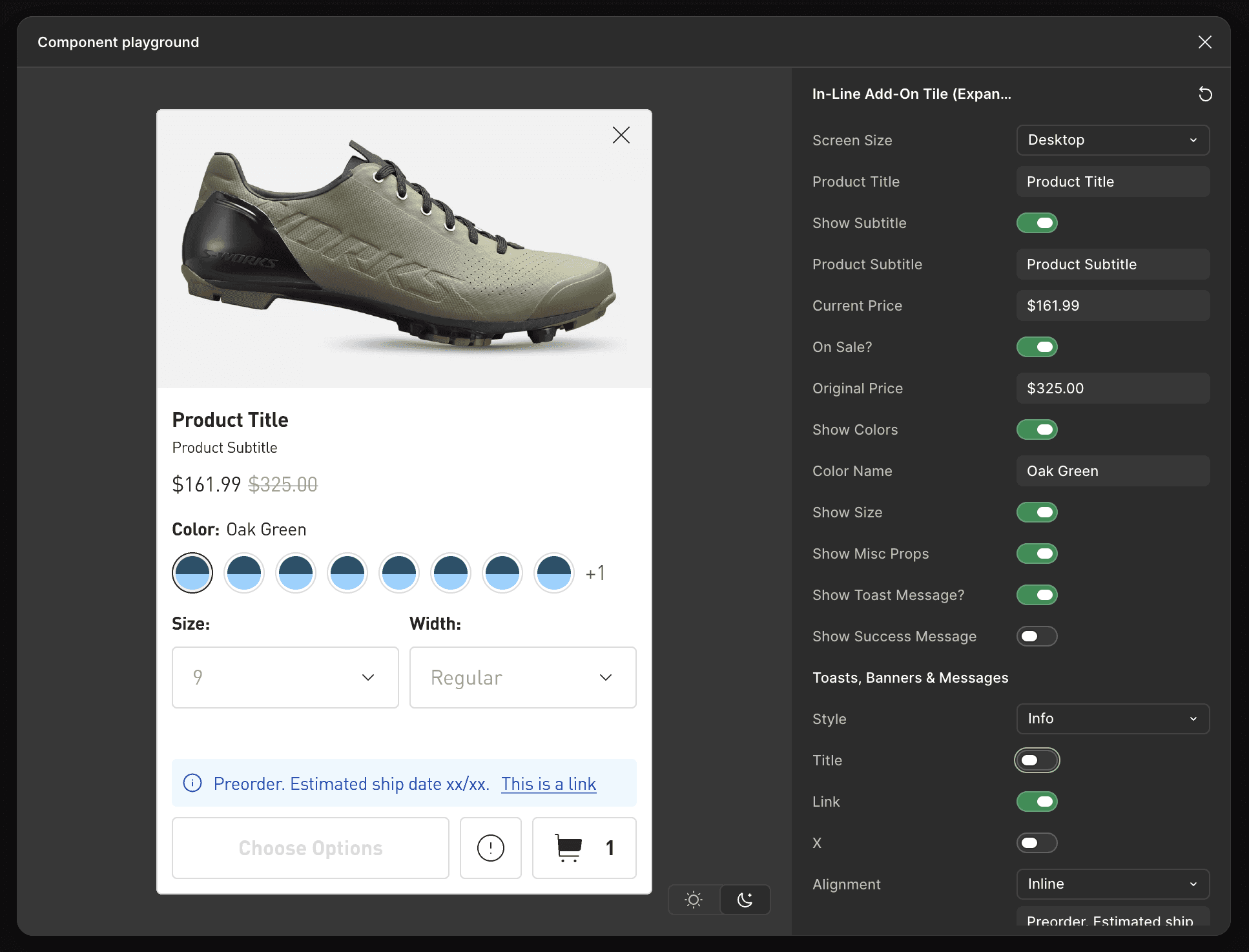
Merged, variant-based components built on the tokens, covering the full range of patterns across the app, e-commerce, and B2B. Consistent naming, structure, and states throughout, with accessibility built into the base components instead of handled case by case. |
A responsive layout system |
|---|
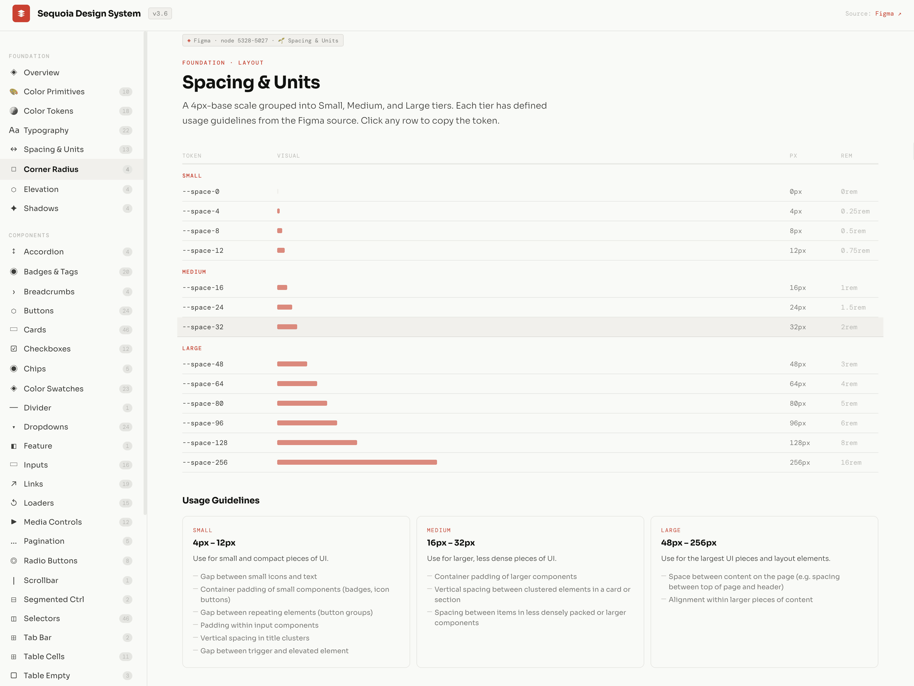
A standard grid and layout system across breakpoints, so designers and engineers had one shared way to talk about space on every platform. |
Design-to-code documentation |
|---|
Shared docs covering component designs (variants & states), usage, and edge cases. We versioned each release and kept up to date right alongside the system. |
Outcome
Less design debt, faster delivery, a foundation that won't fragment again
Sequoia turned a pile of fragmented libraries into one system teams design and ship from every day. While I can't share specific numbers, the impact shows up clear in four places:
→ Less design debt
the duplicate components and one-offs got replaced by one shared library
→ More consistency
one token layer and component set, so the app, e-commerce, and B2B actually feel like the same company
→ Faster delivery
teams spend less time re-deciding the basics and more time on the actual product
→ Room to grow
the architecture can take on new platforms and product lines without splintering again
Jack Sadler, a Senior UI Designer, Design Systems at Specialized, described it as two years of working sessions with "meticulous attention to detail" and "universally applicable" decisions, which says as much about how it got built as what got built.
Lessons
A design system is only as valuable as its adoption
Design systems work is really organizational work with a Figma file attached. The hardest parts of Sequoia weren't the component architecture or naming the tokens, they were alignment, adoption, and governance. Getting teams to trust a new system and actually use it takes as much talking and facilitating as it does design.
The other thing I took away: the best systems aren't dreamed up in a vacuum, they come out of real product problems. Sequoia got better because it was built right next to the Specialized app, under real constraints, solving real problems. That shaped nearly every architectural call in a way a from-scratch project never would have.
It's the work I'm most proud of so far, not because it looks impressive, but because it works. Teams are faster, more consistent, and more confident because of it. That's the whole point of a solid built design system.