Specialized Bicycle Components
Designing a native app for cyclists
The Specialized App is a cycling companion app that lets riders track rides, analyze performance, and manage their bike. It offers a highly tailored experience for e-bikes (power tuning, battery management, security features, and much more...) and integrates with platforms like Strava and Apple Health to enhance the overall riding experience. This is the story of consolidating a fragmented, multi-app rider experience into a single (native iOS and Android) app and building the component foundation that would let Specialized scale it into the future.

Overview
A single companion app for every ride
When I joined the mobile app team at Specialized, the rider-facing app ecosystem was focused on rebuilding the fractured experience across multiple digital products.
My work focused on consolidating that experience into a single, unified app and building the design foundation that would allow the team to scale it consistently across platforms.
My role was a native app product designer supporting Director of UX, Apps with UX strategy, user journeys, information architecture, and design system for the full app consolidation & migration. I worked across iOS and Android in close partnership with engineering, product, and QA.
Challenge
Riders were managing their bike across multiple, disconnected apps
The core challenge wasn't just visual re-polish, it needed structural change. As a team, we needed to rethink how the product was organized before we could improve how it looked or felt. Riders were navigating multiple apps to manage their bike experience, creating friction, drop-off, and low feature adoption.
Fragmented experience
Inconsistent UI patterns and duplicated functionality created confusion about where features lived and what app did what.
Low feature understanding
Key features like Turbo tuning and ride analytics were not fully understood or discoverable to riders.
Broken data flows
Ride records were disconnected across tools, undermining trust in the data.
Drop-off over time
Without a clear understanding of which app did what, riders disengaged rather than building habits around the app.
Approach
Before we designed anything
Audited the existing ecosystem before touching UI, established a unified navigation structure first, and built every component with reuse and system scalability in mind.
Discovery & framing
I started by auditing the existing app ecosystem by mapping all entry points, flows, and feature locations across the separate apps to understand where overlap and confusion were highest. This audit directly informed the consolidation strategy and gave the team a shared picture of the problem before we began designing solutions.
Information architecture
Before designing any UI, I focused on navigation structure. The goal was a single hierarchy that could accommodate ride recording, bike management, service recommendations, performance analytics, and third-party integrations without overwhelming a rider who just wanted to start a ride. I explored several models, pressure-tested them against the range of user types (casual riders vs. power users), worked with our beta program, and aligned with the team on a structure before moving to high-fidelity design.
Design system integration
Rather than designing one-off screens, I built components and patterns that could be reused across the app. This meant making decisions at the component level (interaction states, token usage, responsive behavior) that would hold up beyond this single project.
Iteration with engineering
I worked in close collaboration with the engineering team throughout, running regular design/dev syncs to validate feasibility, catch drift early, and ensure what we shipped matched what was designed. This feedback loop helped refine many of the strongest features in the app – ride recording experience (map + stats view), Smart Control (range anxiety solution), and custom bike tuning.
Designs
Ride recording, tuning, and bike management
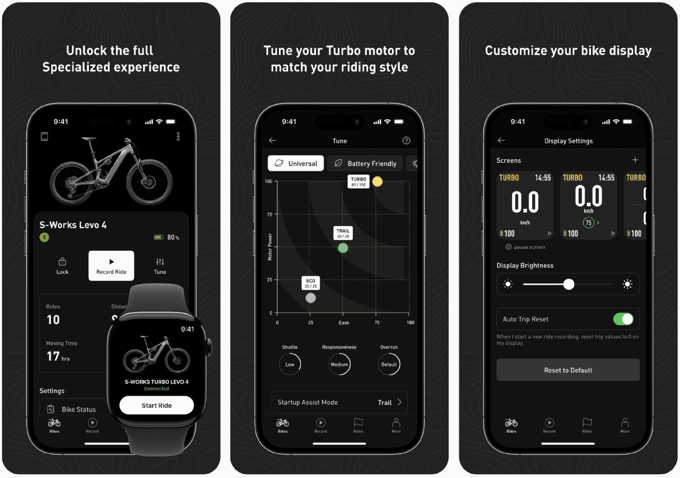
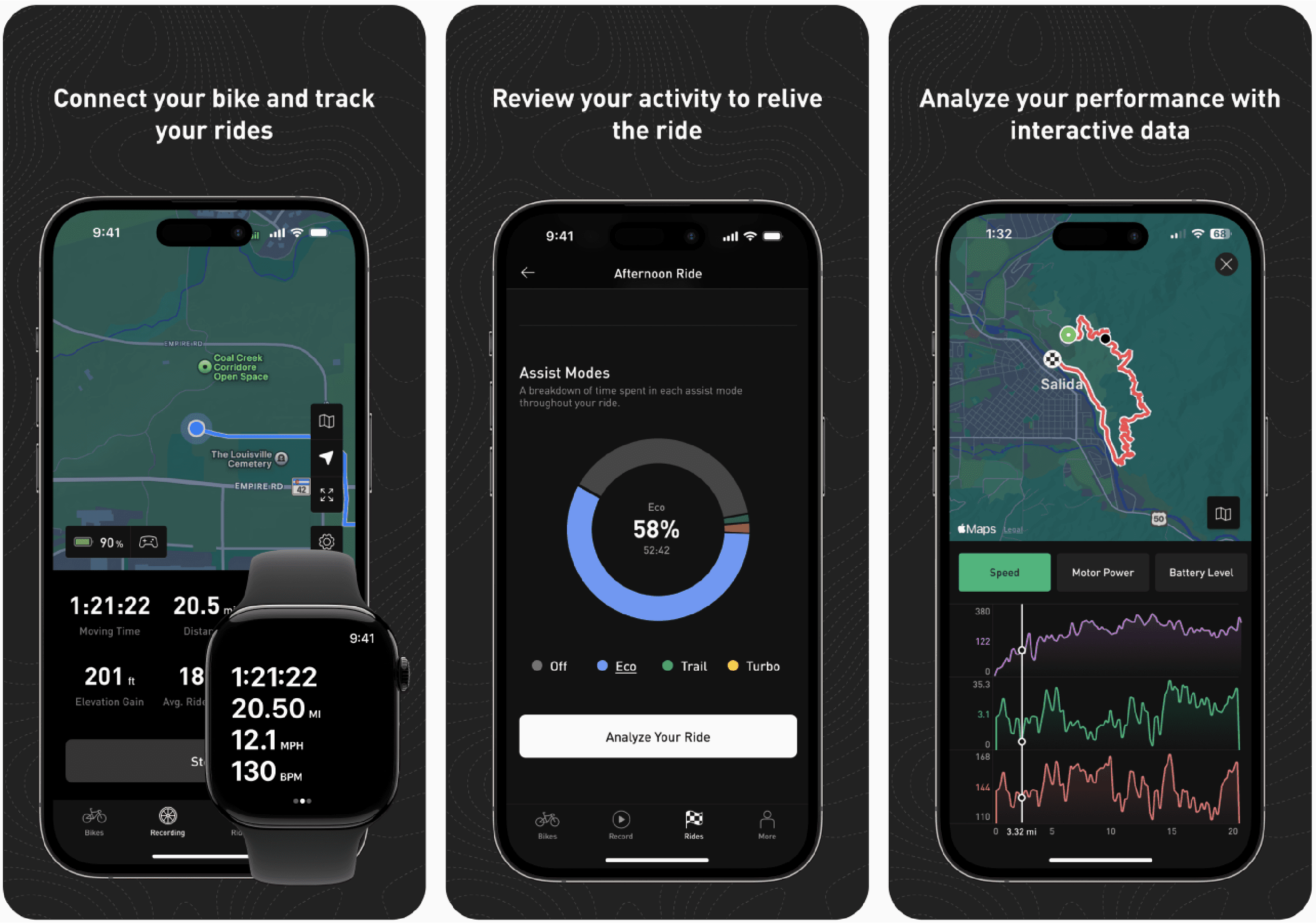
Sizzle Reel (Motion & Interaction Design)
Solution
Everything a rider needs, in one place
The consolidated app brings ride recording, bike management, and performance insights into a single, rider-centered experience.
→ Unified architecture
A single app architecture replaced the multi-app ecosystem, with consistent navigation patterns that let riders move between ride recording, bike settings, over-the-air updates, and ride history without context switching between apps.
→ Ride tracking & performance
Smart, continuous ride recording with real-time GPS metrics and detailed post-ride summaries. Interactive charts surface insights that motivate riders without overwhelming them. Integration with Strava, Garmin, and Apple Health connects the app to the broader ecosystems riders already use.
→ Turbo e-bike management
In-app registration, warranty activation, and tailored control over power delivery, battery performance, and display stats. Security features including Turbo System Lock and real-time system alerts give Turbo owners confidence in their investment.
→ Scalable component foundation
Every pattern I designed was built with reuse in mind, consistent interaction states, shared tokens, documented usage guidelines. This groundwork directly enabled the Sequoia Design System that followed.
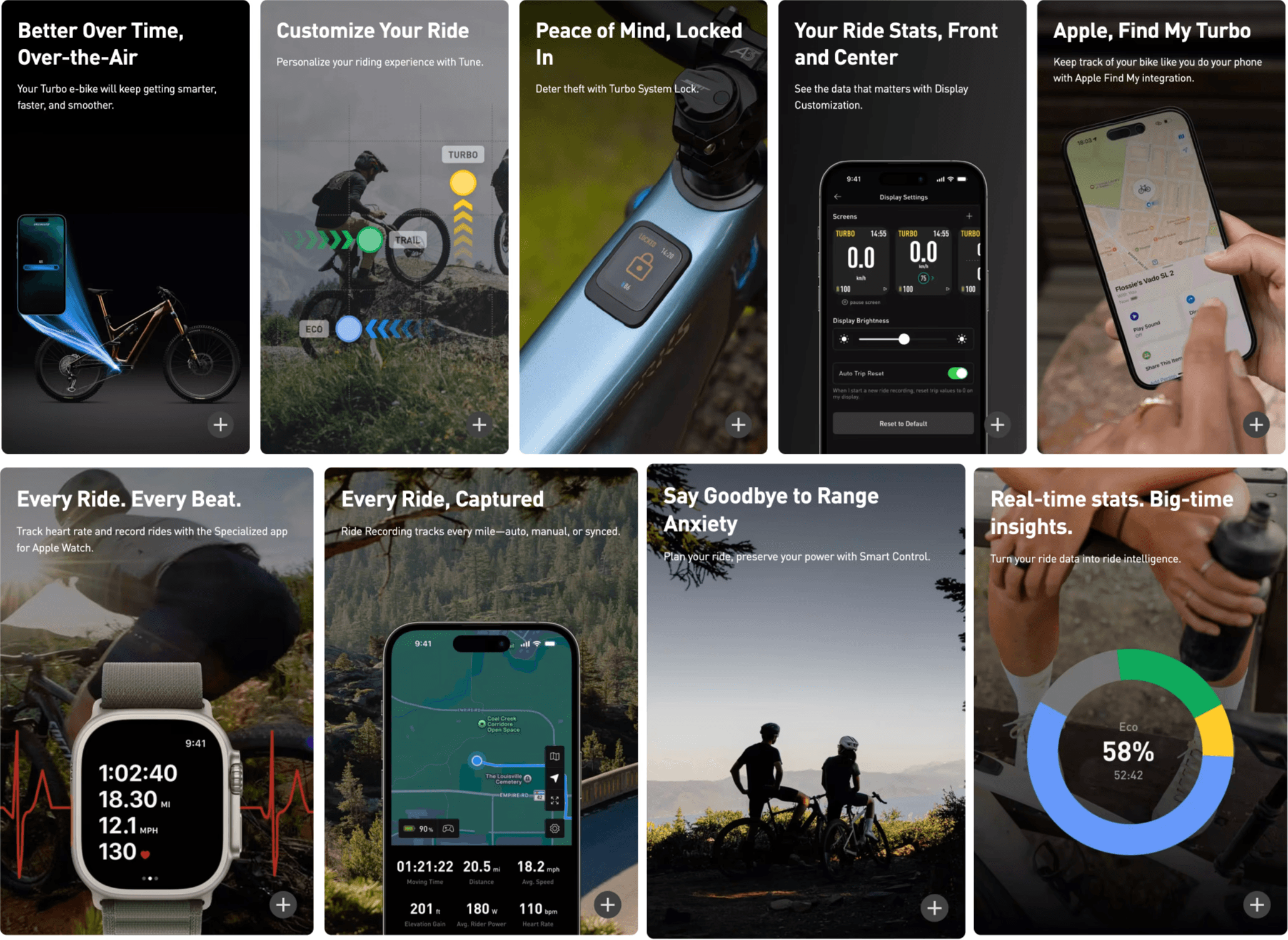
What's Next? – Responding to Feedback (Motion & Interaction Design)
Outcome
A unified app riders trust, built to scale
A single, rider-centered app that eliminated fragmentation, surfaced key features more clearly, and laid the foundation for Sequoia, Specialized's enterprise design system.
Few metrics I can share, based on 2024 data from app & riders:
- 417k new installs
- 21k unique cities
- 188 unique countries
- 274k MAUs (monthly active users)
- 529 million minutes moving (+1,000 years)
- 2 billion meters of climbing
Consolidation projects are as much organizational as they are design challenges. Getting alignment on information architecture before anyone sees a screen saved significant rework. Building components with the system in mind from day one, rather than retrofitting them later, is the difference between a project that contributes to scale and one that adds to design debt.
Lessons
What was learned along the way
The most impactful design work on this project happened before any screens were made. Alignment on structure and system thinking from day one prevented rework and created compounding value beyond the project itself.
Consolidation projects are as much organizational as they are design challenges. Getting alignment on information architecture before anyone sees a screen saved significant rework. Building components with the system in mind from day one, rather than retrofitting them later, is the difference between a project that contributes to scale and one that adds to design debt.